Chapter 14 Data Tabulation

The raw statistical material is based only on the collected data - in its original form.
The development of statistical material includes:
initial verification for completeness and elimination of systematic and accidental errors (unsystematic),
organization (systematization) and grouping,
tabular presentation,
graphic presentation (charts).
14.1 Frequency Tables
Frequency Table: A grouping of qualitative data into mutually exclusive classes (categories) showing the number of observations in each class.
5 Steps To Organize Raw Data Into A Frequency Distribution:
Decide on Number of Classes
Determine The Class Interval
Set The Individual Class Limits
Tally The Data Into Classes
Count The Tallies in Each Class & Present the Frequency Distribution
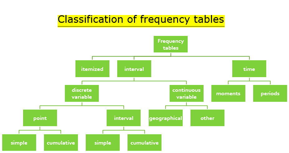
Classification of Frequency Tables:
14.1.1 Tables in R
There are several easy ways to create an R frequency table, ranging from using the factor() and R table() functions in Base R to specific packages. Each different R function for creating a good data table output has its own benefits, from creating a column header and row names to column index, table command, character vector support, being able to import a data file, or multiple columns, but many need a specific R package to properly show you how to make a table in R code. Good packages include ggmodels, dplyr, and epiDisplay.
You can generate frequency tables using the table() function, tables
of proportions using the prop.table() function, and marginal
frequencies using margin.table().
The most common and straight forward method of generating a frequency table in R is through the use of the table function. In this tutorial, I will be categorizing cars in my data set according to their number of cylinders. I’ll start by checking the range of the number of cylinders present in the cars.
data(mtcars)
factor(mtcars$cyl)
## [1] 6 6 4 6 8 6 8 4 4 6 6 8 8 8 8 8 8 4 4 4 4 8 8 8 8 4 4 4 8 6 8 4
## Levels: 4 6 8This quickly tells me that the cars in my data set have 4, 6 or 8 cylinders. I can now use the table() function to see how many cars fall in each category of the number of cylinders.
Let’s create the table now:
table(mtcars$cyl)##
## 4 6 8
## 11 7 14This tells me that 11 cars have 4, 7 cars have 6 and 14 cars have 8 cylinders.
However, something you may have noticed here is that this is a very non explanatory table and isn’t the best representation of categorical variables. Moreover, the table is not stored as a data frame and this makes further analysis and manipulation quite difficult. You could always find a way around it, but I usually think of table generation as a quick process and you shouldn’t have to spend too long making your table look better.
One alternative is to use the count() function that comes as a part of the “plyr” package. If you haven’t installed it already, you can do that using the code below.
library('plyr')
count(mtcars, 'cyl')
## cyl freq
## 1 4 11
## 2 6 7
## 3 8 14This table includes distinct values, making creating a frequency count or relative frequency table fairly easy, but this can also work with a categorical variable instead of a numeric variable - think pie chart or histogram.
One other function that I’ll be going over comes in the “epiDisplay” package. It gives you a highly featured report of your dataset that includes descriptive statistics functions like absolute frequency, cumulative frequencies and proportions. If, for instance, you wish to know what percentage of cars have 8 cylinders or what fraction of cars have 4 gears, this method allows you to get your answer using the same report.
library(epiDisplay)
tab1(mtcars$cyl, sort.group = "decreasing", cum.percent = TRUE)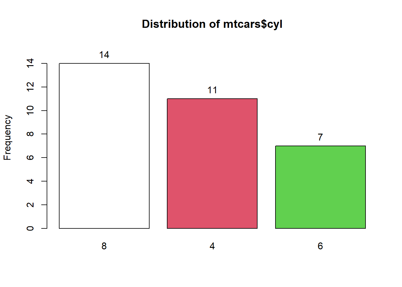
## mtcars$cyl :
##         Frequency Percent Cum. percent
## 8              14    43.8         43.8
## 4              11    34.4         78.1
## 6               7    21.9        100.0
##   Total        32   100.0        100.0
14.2 Cross-tabulations
14.2.1 Cross-tabs in R
For data analysts, an important task would be to generate a frequency with 2, 3 or even more variables. Such a table is also called a Cross Table or a Contingency Table. When talking about a two way frequency table, I find it important to extend the discussion to tables with higher numeric variable numbers as well.
If we talk again about the data frame that “mtcars”, suppose we want to know how many cars use a combination of 4 cylinders and 5 forward gears. One way would be to do this manually using two different frequency tables, but that method is quite inefficient especially if my data set had more variables.
Another method is to use the CrossTable() function from the
“gmodels” package. It not only gives me a cumulative frequency count
but also the proportions and the chi square test contribution of each
category.
library(gmodels)
CrossTable(mtcars$cyl, mtcars$gear, prop.t=TRUE, prop.r=TRUE, prop.c=TRUE)
##
##
## Cell Contents
## |-------------------------|
## | N |
## | Chi-square contribution |
## | N / Row Total |
## | N / Col Total |
## | N / Table Total |
## |-------------------------|
##
##
## Total Observations in Table: 32
##
##
## | mtcars$gear
## mtcars$cyl | 3 | 4 | 5 | Row Total |
## -------------|-----------|-----------|-----------|-----------|
## 4 | 1 | 8 | 2 | 11 |
## | 3.350 | 3.640 | 0.046 | |
## | 0.091 | 0.727 | 0.182 | 0.344 |
## | 0.067 | 0.667 | 0.400 | |
## | 0.031 | 0.250 | 0.062 | |
## -------------|-----------|-----------|-----------|-----------|
## 6 | 2 | 4 | 1 | 7 |
## | 0.500 | 0.720 | 0.008 | |
## | 0.286 | 0.571 | 0.143 | 0.219 |
## | 0.133 | 0.333 | 0.200 | |
## | 0.062 | 0.125 | 0.031 | |
## -------------|-----------|-----------|-----------|-----------|
## 8 | 12 | 0 | 2 | 14 |
## | 4.505 | 5.250 | 0.016 | |
## | 0.857 | 0.000 | 0.143 | 0.438 |
## | 0.800 | 0.000 | 0.400 | |
## | 0.375 | 0.000 | 0.062 | |
## -------------|-----------|-----------|-----------|-----------|
## Column Total | 15 | 12 | 5 | 32 |
## | 0.469 | 0.375 | 0.156 | |
## -------------|-----------|-----------|-----------|-----------|
##
## I have added the “prop.r” and the “prop.c” parameters and set them to
TRUE here. This is optional but when specified, it gives me the row
percentages and the column percentages for each category. Moreover,
“prop.t” gives me a table percentage as well. This information is
particularly useful when you want to compare one variable with another,
tabulate other numeric vector actions, or find something like the phi
coefficient of a data value.
14.3 Kable package
We can create awesome HTML tables with the ‘kable’ and “kableextra” packages! Go to this tutorial and study all the possibilites of those.