
Chapter 16 Bivariate Analysis

Bivariate analysis is one of the simplest forms of quantitative analysis. It involves the analysis of two variables, for the purpose of determining the empirical relationship between them.
16.1 Spurious correlations
Is there a correlation between Nic Cage films and swimming pool accidents? What about beef consumption and people getting struck by lightning? Absolutely not!
Spurious correlation, or spuriousness, occurs when two factors appear casually related to one another but are not. The appearance of a causal relationship is often due to similar movement on a chart that turns out to be coincidental or caused by a third “confounding” factor.
If two variables are significantly correlated, this does not imply that one must be the cause of the other! The degree of association is not directly proportional to the magnitude of the correlation coefficient. The correlation coefficient is subject to variations in sampling. Correlation between two variables that is really induced by other external variables is referred to as spurious correlation or false correlation!
Correlation ≠ Causation
Just because you have a high r value does not mean that x causes y… be careful!! There could be a “lurking variable” that actually is the cause!
Please see some examples here ;-)
16.2 Bivariate data
There are 3 main goals of bivariate analysis:
To account for why the dependent variable varies among respondents
To predict future occurrences
Describe relationships among variables
Bivariate Data: consists of the values of two different response variables that are obtained from the same population of interest.
3 combinations of variable types:
- Both variables are qualitative (attribute)
- One variable is qualitative (attribute) and the other is quantitative (numerical)
- Both variables are quantitative (both numerical)
First you need to label each variable in your study as nominal, ordinal, or interval/ratio. Then, decide how you will present the data and select the most relevant statistics.
The consideration of whether there is any relationship or association between two variables is called correlation analysis.
The correlation coefficient is the index which defines the strength of association between two variables.
Dependent and independent variables:
To establish whether there is a relationship between two variables, an appropriate random sample must be taken and a measurement recorded of each of the two variables.
Such data are said to be bivariate data, since they consist of two variables. Data may be written as ordered pairs, where they are expressed in a specific order for each individual, i.e. (first variable value, second variable value):
- Not very often, data may be organized in correlation diagrams:
Based on the measurement scale and the form, how data are organized - depends the further way how to provide the bivariate analysis.
16.3 Quantitative pairs
Quantitative pairs are usually expressed as raw data and presented on the scatterplots. The measurements may be made with the various coefficients, but usually we use the r linear correlation coefficient or eta - nonlinear coefficient and their difference in case of nonlinearities.
16.3.1 Scatterplots
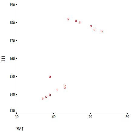
A scatter diagram or scatter plot is a display in which ordered pairs of measurements are plotted on a coordinate axes system.
The independent variable (x) is represented on the horizontal axis.
The dependent variable (y) is represented on the vertical axis.
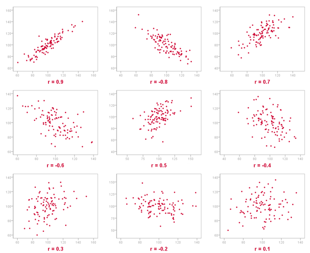
The points representing the data are usually plotted either by dots or crosses. On the scatters the different strengths of the linear correlations are presented:
EXAMPLE: CREDIT SCORING DATA
This time we are going to use a typical credit scoring data with predefined “default” variables and personal demographic and income data.
First let’s visualize our quantitative relationships using scatterplots.
#install.packages("ggplot2", dependencies=TRUE)
library(ggplot2)
# Change the point size, and shape
ggplot(bank_defaults, aes(x=age, y=income)) +
  geom_point(size=2, shape=23)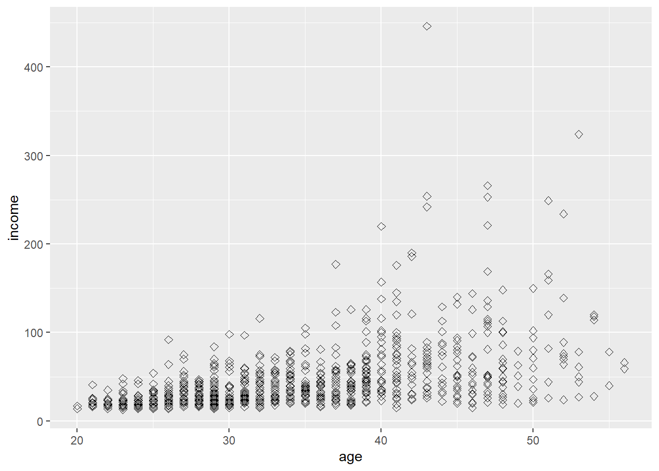
As we can see, we need to transform the skewed distribution of incomes using log:
bank_defaults$log_income<-log(bank_defaults$income)
# Basic scatter plot with the log of income
ggplot(bank_defaults, aes(x=age, y=log_income)) + geom_point()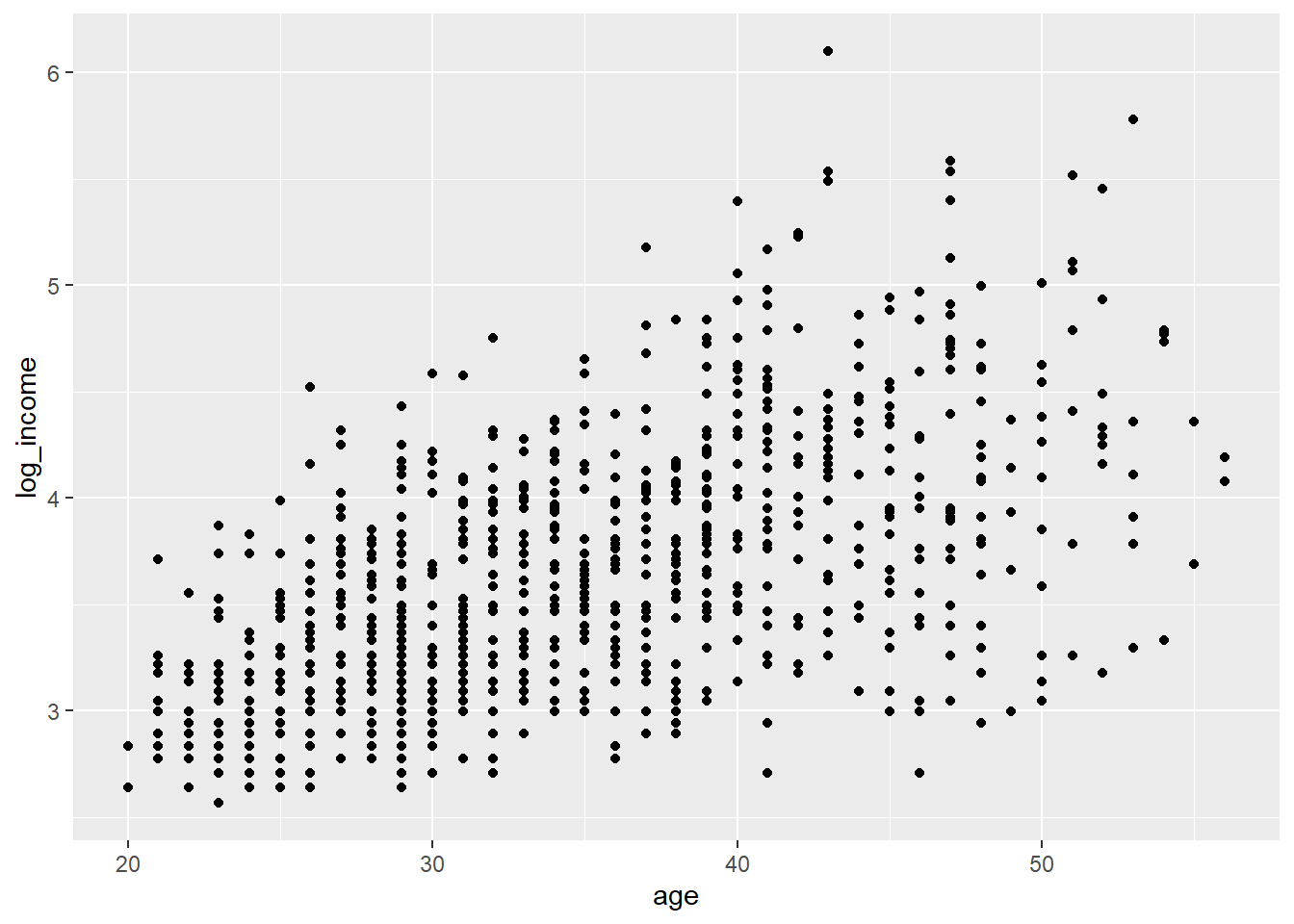 #### Scatterplots by groups
We may see if there any differences between risk status:
#install.packages('knitr')
#Loading the libraries and datasets
#install.packages('HSAUR3')
#install.packages('tidyverse')
#install.packages('dplyr')
library(dplyr)
library(tidyverse)
library(HSAUR3)
bank<-na.omit(bank_defaults)
bank$def<-as.factor(bank$default)
ggplot(data=bank, aes(x=age, y=log_income, color=def, shape=def)) + geom_point() + geom_smooth(method="lm") +
labs(title="Income profiles by age vs. risk status",
     x="Age",
y="Log of Income") 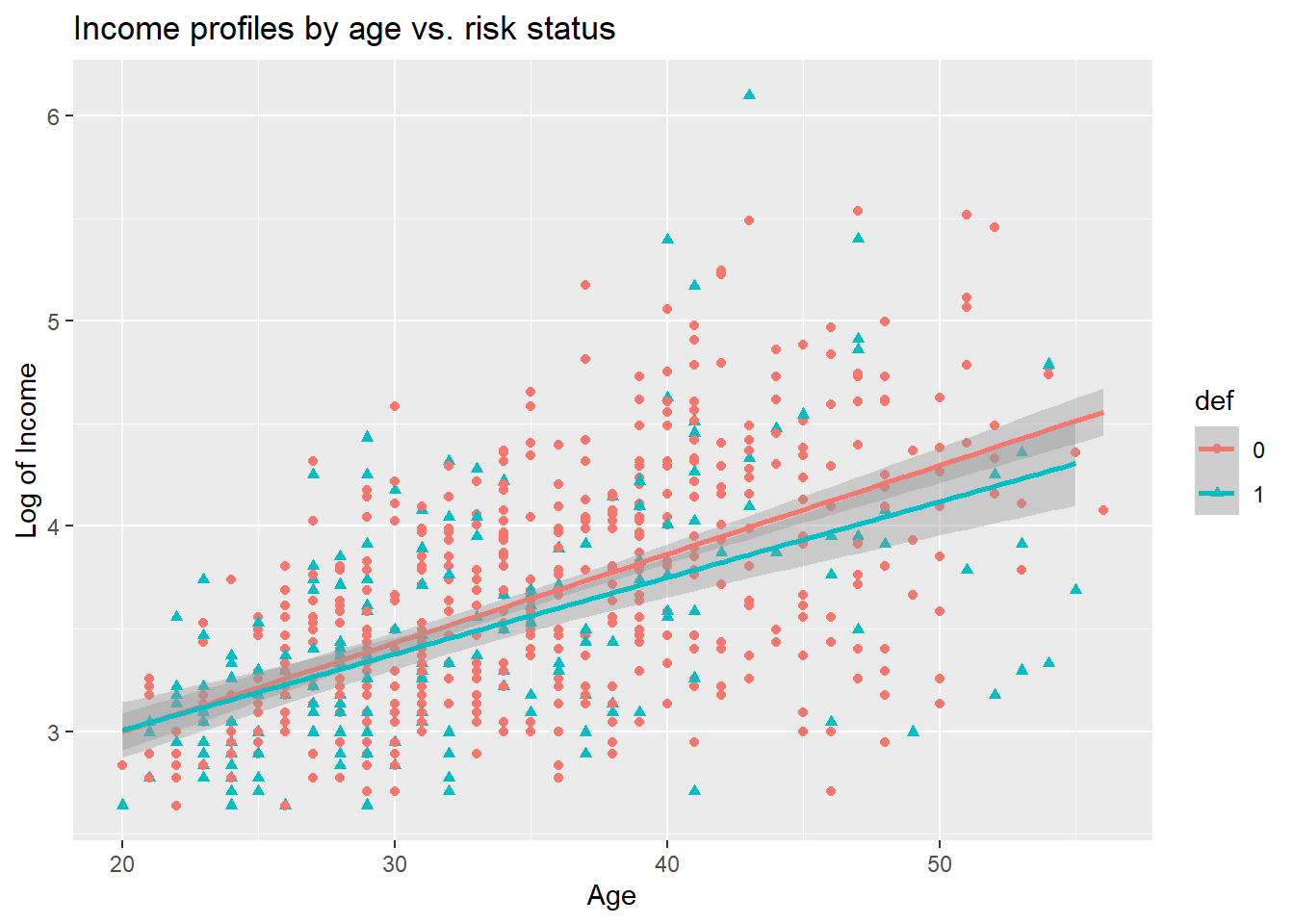
The heterogeneity maybe is not so strong on the picture, but it is always worth checking if there are any differences.
We can also see more closely if there any differences between those two distributions adding their estimated density plots:
# scatter plot of x and y variables
# color by groups
scatterPlot <- ggplot(bank,aes(age, log_income, color=def)) +
  geom_point() +
  scale_color_manual(values = c('#999999','#E69F00')) +
  theme(legend.position=c(0,1), legend.justification=c(0,1))
# Marginal density plot of age (top panel)
agedensity <- ggplot(bank, aes(age, fill=def)) +
  geom_density(alpha=.5) +
  scale_fill_manual(values = c('#999999','#E69F00')) +
  theme(legend.position = "none")
agedensity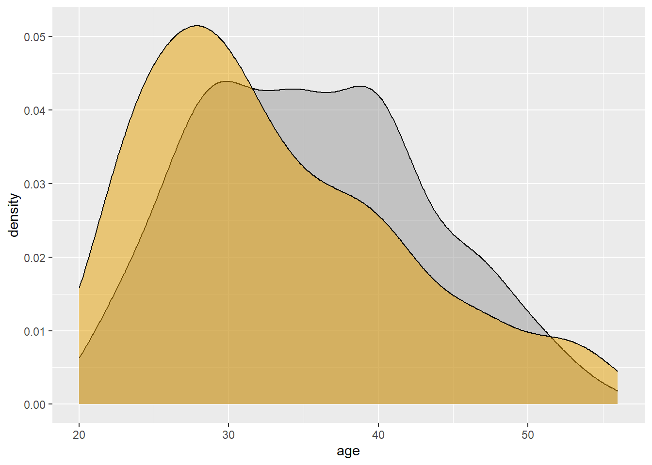
# Marginal density plot of y (right panel)
incomedensity <- ggplot(bank, aes(income, fill=def)) +
geom_density(alpha=.5) +
scale_fill_manual(values = c('#999999','#E69F00')) +
theme(legend.position = "none")
incomedensity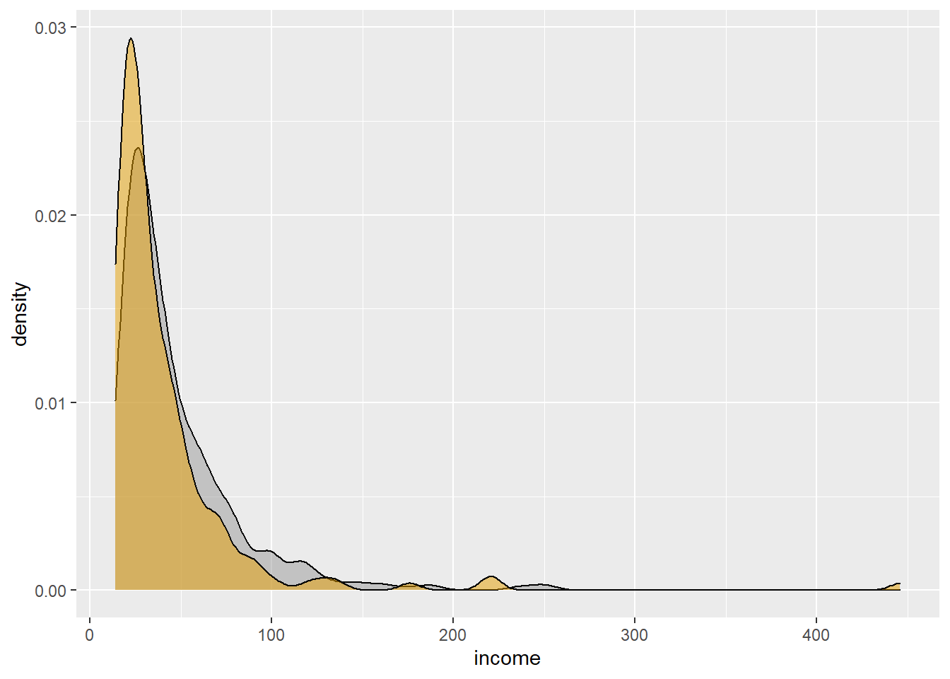 #### Scatterplots with density curves
We can also see more closely if there any differences between those two distributions adding their estimated density plots:
#install.packages("gridExtra")
library("gridExtra")
# Create a blank placeholder plot:
blankPlot <- ggplot()+geom_blank(aes(1,1))+
  theme(plot.background = element_blank(),
   panel.grid.major = element_blank(),
   panel.grid.minor = element_blank(),
   panel.border = element_blank(),
   panel.background = element_blank(),
   axis.title.x = element_blank(),
   axis.title.y = element_blank(),
   axis.text.x = element_blank(),
   axis.text.y = element_blank(),
   axis.ticks = element_blank()
     )
grid.arrange(agedensity, blankPlot, scatterPlot, incomedensity,
        ncol=2, nrow=2, widths=c(4, 1.4), heights=c(1.4, 4))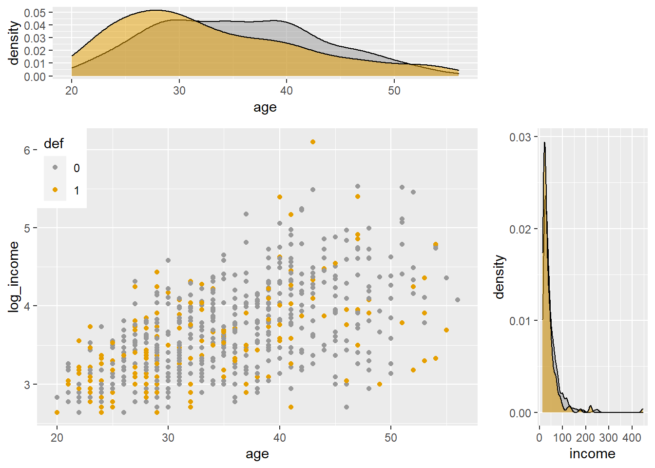
16.3.2 Linear correlation
The linear correlation coefficient measures the strength of a linear relationship between two variables.
- As x increases, no definite shift in y: no correlation.
- As x increase, a definite shift in y: correlation.
- Positive correlation: x increases, y increases.
- Negative correlation: x increases, y decreases.
For pairs of raw data we must first measure, how the two quantitative variables co-vary:
Then, we may start calculating the coefficient of linear correlation: r which measures the strength of the linear relationship between two variables.
Note:
The value of r must always lie between -1 and +1 (both inclusive).
If r = +1, the two variables have perfect positive correlation.
This means that on a scatter diagram, the points all lie on a straight line that has a positive slope If r = -1, the two variables have perfect negative correlation.
This means that on a scatter diagram, the points all lie on a straight line that has a negative slope.
If the two variables are positively correlated, but not perfectly so, the coefficient lies between 0 and 1.
If the two variables are negatively correlated, but not perfectly so, the coefficient lies between -1 and 0.
If the two variables have no overall upward or downward trend whatsoever, the coefficient is 0.
Pearson’s product moment formula:
Note, that when r is close to 0 it means, that there is no linear correlation (but only linear!!!). Maybe, after some transformations - the relationship would be non-linear?
16.3.2.1 Assumptions
To measure the relationship between 2 quantitative variables with the use of linear correlation coefficient correctly - we must follow several rules:
First of all, both variables must be normally distributed. If one or both are not, either transform the variables to near normality or use an alternative non-parametric measure of Spearman. Use Spearman Correlation coefficient when the shape of the distribution is not assumed or variable is distribution-free.
No categorical or nominal variables! r does not change when we change the units of measurement. For example, from Kg to pounds for weight. Why? r uses standardized values of the observations
r does not measure nor describe curved or non-linear association no matter how strong!
Like the mean and SD, r is not resistant or uninfluenced by outliers!
If non-linear, consider transforming variables to “create” linear relationship = equivalent to finding a non-linear mathematical function to describe the relationship between the variables!
16.3.2.2 Heterogenous samples
Please be aware, that very often, there are many sub-samples, which are heterogenous. Sub-samples (e.g., males & females) may artificially increase or decrease overall r.
Solution - calculate r separately for sub-samples & overall, look for differences:
16.3.2.3 Outliers
Outliers can disproportionately increase or decrease r.
Options: - compute r with & without outliers - get more data for outlying values - recode outliers as having more conservative scores transformation - recode variable into lower level of measurement
EXAMPLE continued:
Ok, let’s move to some calculations. In R, we can use the cor() function. It takes three arguments and the method: cor(x, y, method).
For 2 quantitative data, with all assumptions met, we can calculate simple Pearson’s coefficient of linear correlation:
r<-cor(bank$log_income, bank$age, method = "pearson")
r
## [1] 0.574346We see, that between age and (log) of income there is a moderate relationship, and it is positive.
16.3.2.4 Coefficient of determination
If you will square the correlation coefficient, then the so called “coefficient of determination” will be obtained.
It represents the total proportion of variance in Y explained by X. Desired R-squared is: 80% or more.
EXAMPLE continued:
Ok, what about the percentage of the explained variability?
r2<-r^2
r2
## [1] 0.3298734So as we can see almost 33% of total log of incomes’ variability is explained by differences in age. The rest (67%) is probably explained by other factors.
16.3.3 Partial correlations
“The partial correlation can be explained as the association between two random variables after eliminating the effect of all other random variables, while the semi-partial correlation eliminates the effect of a fraction of other random variables, for instance, removing the effect of all other random variables from just one of two interesting random variables. The rationale for the partial and semi- partial correlations is to estimate a direct relationship or association between two random variables.” {Kim, S. (2015) Commun Stat Appl Methods 22(6): 665–674.}
A partial correlation determines the linear relationship between two variables when accounting for one or more other variables.
Typically, researchers and practitioners apply partial correlation analyses when (a) a variable is known to bias a relationship (b) or a certain variable is already known to have an impact, and you want to analyze the relationship of two variables beyond this other known variable.
A partial correlation coefficient measures the association between two variables after controlling for, or adjusting for, the effects of one or more additional variables:
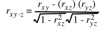
Partial correlations have an order associated with them. The order indicates how many variables are being adjusted or controlled.
The simple correlation coefficient, r, has a zero-order, as it does not control for any additional variables while measuring the association between two variables.
The coefficient rxy.z is a first-order partial correlation coefficient, as it controls for the effect of one additional variable, Z.
A second-order partial correlation coefficient controls for the effects of two variables, a third-order for the effects of three variables, and so on.
The special case when a partial correlation is larger than its respective zero-order correlation involves a suppressor effect.
16.3.4 Part correlation
The part correlation coefficient represents the correlation between Y and X when the linear effects of the other independent variables have been removed from X but not from Y.
The part correlation coefficient, ry(x.z) is calculated as follows:
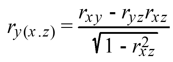
The partial correlation coefficient is generally viewed as more important than the part correlation coefficient.
Partial vs. Semipartial (part) correlation:
Both compare variations of two variables after certain factors are controlled for, but to calculate the semipartial correlation one holds the third variable constant for either X or Y but not both, whereas for the partial correlation one holds the third variable constant for both.
The semipartial (or part) correlation can be viewed as more practically relevant because it is scaled to (i.e., relative to) the total variability in the dependent (response) variable.
EXAMPLE continued:
Suppose we want to know the correlation between the log of income and age controlling for years of employment. How highly correlated are these after controlling for tenure?
**There can be more than one control variable.
#install.packages("ppcor")
library(ppcor) # this package computes partial and semipartial correlations.
pcor<-pcor.test(bank$log_income,bank$age,bank$employ)
pcor$estimate
## [1] 0.3194263How can we interpret the obtained partial correlation coefficient? What is the difference between that one and the semi-partial coefficient:
library(ppcor)
spcor<-spcor.test(bank$log_income,bank$age,bank$employ)
spcor$estimate
## [1] 0.220371116.4 Mixed scales
When bivariate data results from one qualitative and one quantitative variable, the quantitative values are viewed as separate samples.
Each set is identified by levels of the qualitative variable. Each sample is described using summary statistics, and the results are displayed for side-by-side comparison. Statistics for comparison: measures of central tendency, measures of variation. Graphs for comparison: dotplot, boxplot.
Example: A random sample of households from three different parts of the country was obtained and their electric bill for June was recorded. The data is given in the table below.

The part of the country is a qualitative variable with three levels of response. The electric bill is a quantitative variable. The electric bills may be compared with numerical and graphical techniques.
16.4.1 Dotplots
Comparison using dotplots:
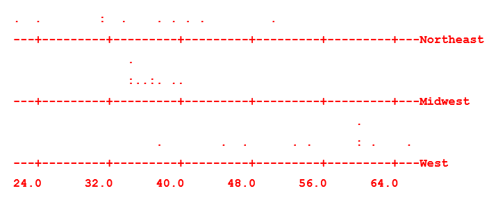
The electric bills in the Northeast tend to be more spread out than those in the Midwest. The bills in the West tend to be higher than both those in the Northeast and Midwest. Any conclusion?
16.4.2 Boxplots
Comparison between 2 different scales usually is made by using Box-and-Whisker plots.
First, let’s see boxplots of income by education levels.
bank$educ<-as.factor(bank$ed)
ggplot(data=bank, aes(x=educ, y=log_income, fill=def)) +
  geom_boxplot() +
labs(title="Income profiles by education vs. risk status",
     x="Education levels",
y="Income") 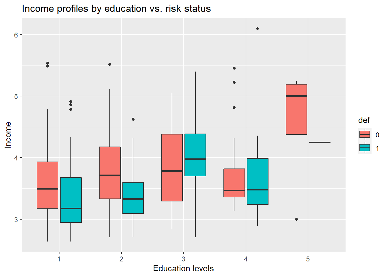
16.4.3 Rank correlations
An alternative measure of the degree of association between two variables is the rank correlation coefficient. This coefficient does not strictly measure the degree of association between the actual observations, but rather the association between the ranks of the observations. That is why we call it a “nonparametric” correlation. It does not require a normal distribution anymore, but it is not recommended to use it instead of the linear correlation coefficient! Thanks to the use of ranks, it is robust for outliers. #### Spearman’s rank correlation
Spearman’s rho statistic is also used to estimate a rank-based measure of association. It is based on a formula:

where: d = difference between corresponding pairs of rankings n = number of pairs of observations
Being a correlation coefficient, the Spearman’s rank correlation coefficient has the following properties: - rs = +1 for perfect positive correlation of the ranks, that is when the x-rank = the y-rank in each case, and hence Σd2 (squared differences between ranks) = 0; - rs = –1 for perfect negative correlation of the ranks, that is when they run in precisely opposite order to each other, and hence

The main disadvantage of this coefficient is that, it is not robust for larger number of ties in rankings.
EXAMPLE continued:
Now, let’s see Spearman’s coefficient of rank correlation (not robust for ties).
r_ken1<-cor(bank$income, bank$ed, method = "spearman")
r_ken1
## [1] 0.2020778The relationship is positive but quite low, so there is probably very little variability of income explained by education levels.
16.4.3.1 Kendall’s tau
Kendall’s tau is another nonparametric correlation and it should be used rather than Spearman’s coefficient when you have a small data set with a large numer of tied ranks.
This means that if you rank all of the scores and many scores have the same rank, then Kendall’s tau should be used.
Kendall’s statistic is actually better estimate of the correlation in the population (see Howell, 1997: 293) – we can draw more accurate generalizations from Kendall’s measure than from Spearman’s.
The Kendall correlation method measures the correspondence between the ranking of x and y variables. The total number of possible pairings of x with y observations is n(n−1)/2, where n is the size of x and y.
The procedure is as follow: Begin by ordering the pairs by the x values. If x and y are correlated, then they would have the same relative rank orders. Now, for each yi, count the number of yj>yi (concordant pairs (c)) and the number of yj<yi (discordant pairs (d)).
It is a coefficient use to measure the association between two pairs of ranked data. Named after British statistician Maurice Kendall who developed it in 1938 ranges from -1.0 to 1.0.
Tau without correction for ties: so-called Tau-a:

where: P is the number of concordant pairs n is the total number of pairs
Tau-b (with correction for ties):
EXAMPLE continued:
Now, let’s see Kendal’s coefficient of rank correlation (robust for ties).
r_ken1<-cor(bank$income, bank$ed, method = "kendal")
r_ken1
## [1] 0.1577567The relationship is positive but quite low, so there is probably very little variability of income explained by education levels. Can you see, that it is even lower for correcting for ties? (than Spearman’s coefficient)
16.4.4 Point-biserial correlation
Point-biserial correlation (rpb) should be used when one variable is dichotomous and the other one is continuous.
We may calculate it as for Pearson’s r, but interpretations must be adjusted to consider the underlying ranked scales e.g., gender and credit scoring status:
Where: - sn is the standard deviation used when you have data for every member of the population/sample; - M1 being the mean value on the continuous variable X for all data points in group 1; - M0 the mean value on the continuous variable X for all data points in group 2; - n1 is the number of data points in group 1, n0 is the number of data points in group 2; - n is the total sample size.
EXAMPLE continued:
Let’s try to verify if there is a significant relationship between incomes and risk status. First, let’s take a look at the boxplot:
ggplot(data=bank, aes(x=def, y=log_income)) +
  geom_boxplot() +
labs(title="Income profiles vs. risk status",
     x="Risk status (default)",
y="Income") 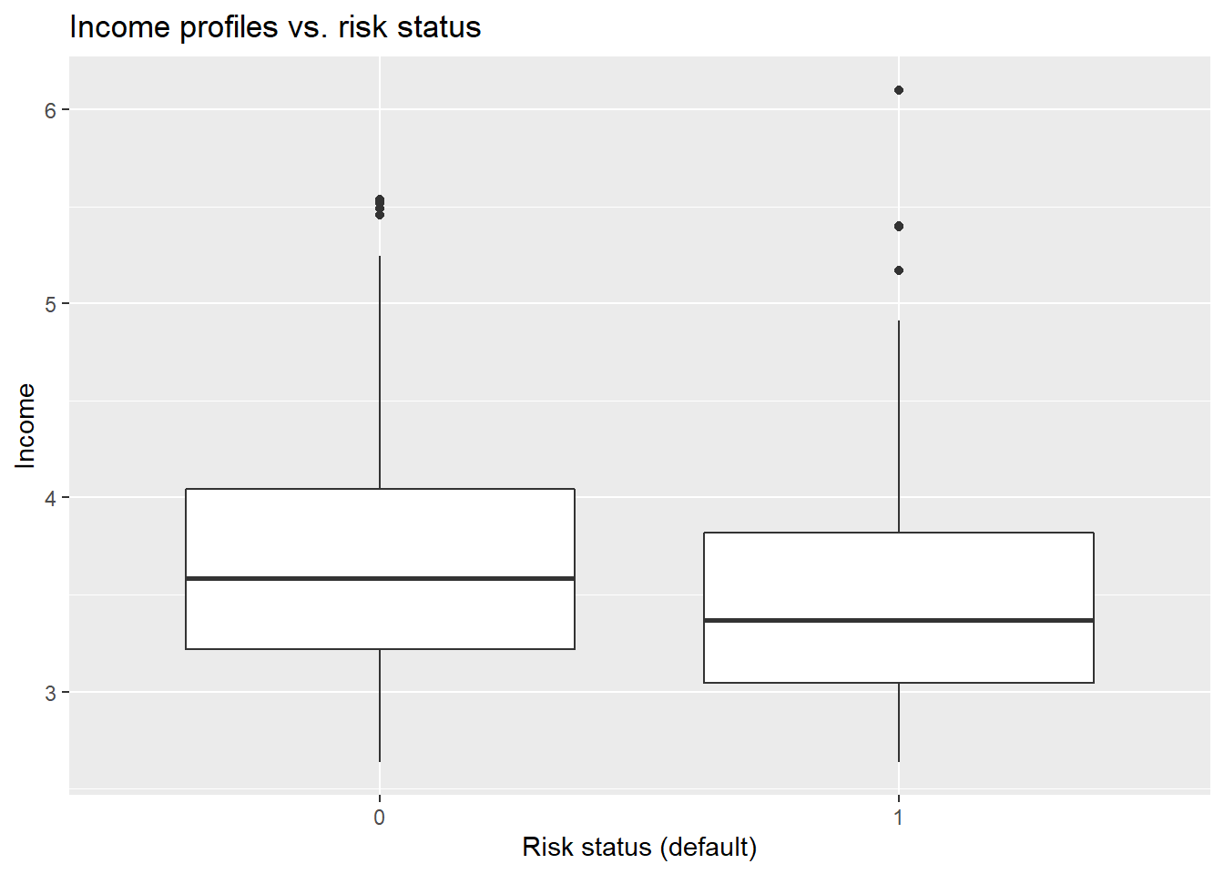
If you would like to compare 1 quantitative variable (income) and 1 dychotomous variable (default status - binary), then you can use point-biserial coefficient:
#install.packages("ltm")
library(ltm)
r_bin1<-biserial.cor(bank$log_income, bank$def)
r_bin1
## [1] 0.1352258As it is visible on the scatterplots, the relationship between income and risk status of customers is very low - possibly no impact on being a “default” customer in credit risk analysis.
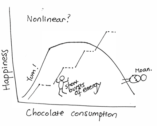
16.5 Nonlinear correlation
What about nonlinearity?
16.5.1 eta
Coefficient of Nonlinear Relationship (eta):
In case of linear relationships, the correlation ratio that is denoted by eta becomes the correlation coefficient.
In case of non-linear relationships, the value of the correlation ratio is greater, and therefore the difference between the correlation ratio and the correlation coefficient refers to the degree of the extent of the non-linearity of relationship!
This statistic is interpretted similar to the Pearson, but can never be negative. It utilizes equal width intervals and always exceeds |r|.
An eta coefficient is a method for determining the strength of association between a categorical variable (e.g., sex, occupation, ethnicity), typically the independent variable and a scale- or interval-level variable (e.g., income, weight, test score), typically the dependent variable. Because the eta coefficient is asymmetric, unlike Pearson’s correlation coefficient, it is important to identify clearly which is your independent and dependent variable.
The eta coefficient is most typically used for testing the strength of nonlinear association between a categorical and a scale variable.
Eta doesn’t depend on regression shape! May be used in both linear and nonlinear relationships! Also appropriate measure for qualitative data ! Used in large samples transformed into correlation diagrams (obviously by R-package, not manually…).
Nonlinearity may be found when difference between robust-to-nonlinearity correlation ratio and Pearson’s coefficient of linear correlation is significant (i.e. >0.2):
and

EXAMPLE continued:
Let’s investigate the difference between correlation ratio and Pearson’s coefficient of linear correlation is significant (i.e. >0.2) for income-age pairs:
library(ryouready)
r_eta1<-eta(as.numeric(bank$income), as.numeric(bank$age))
r_cor1<-cor(as.numeric(bank$income), as.numeric(bank$age))
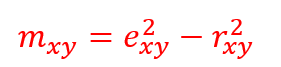
r_eta1 #eta coefficient## [1] 0.6596682r_cor1 #linear coefficient## [1] 0.4787099difference<-(r_eta1)^2-(r_cor1)^2
difference #can you see a significant difference? >0.2?## [1] 0.2059989Difference is substantial = 0.2059 so we may conclude, there is a significant curvilinear relationship.
16.6 Correlation matrix
We can also prepare the correlation matrix for all quantitative variables stored in our data frame.
We can use ggcorr() function:
#install.packages("GGally")
library(GGally)
ggcorr(bank,
nbreaks = 6,
low = "steelblue",
mid = "white",
high = "darkred",
geom = "circle")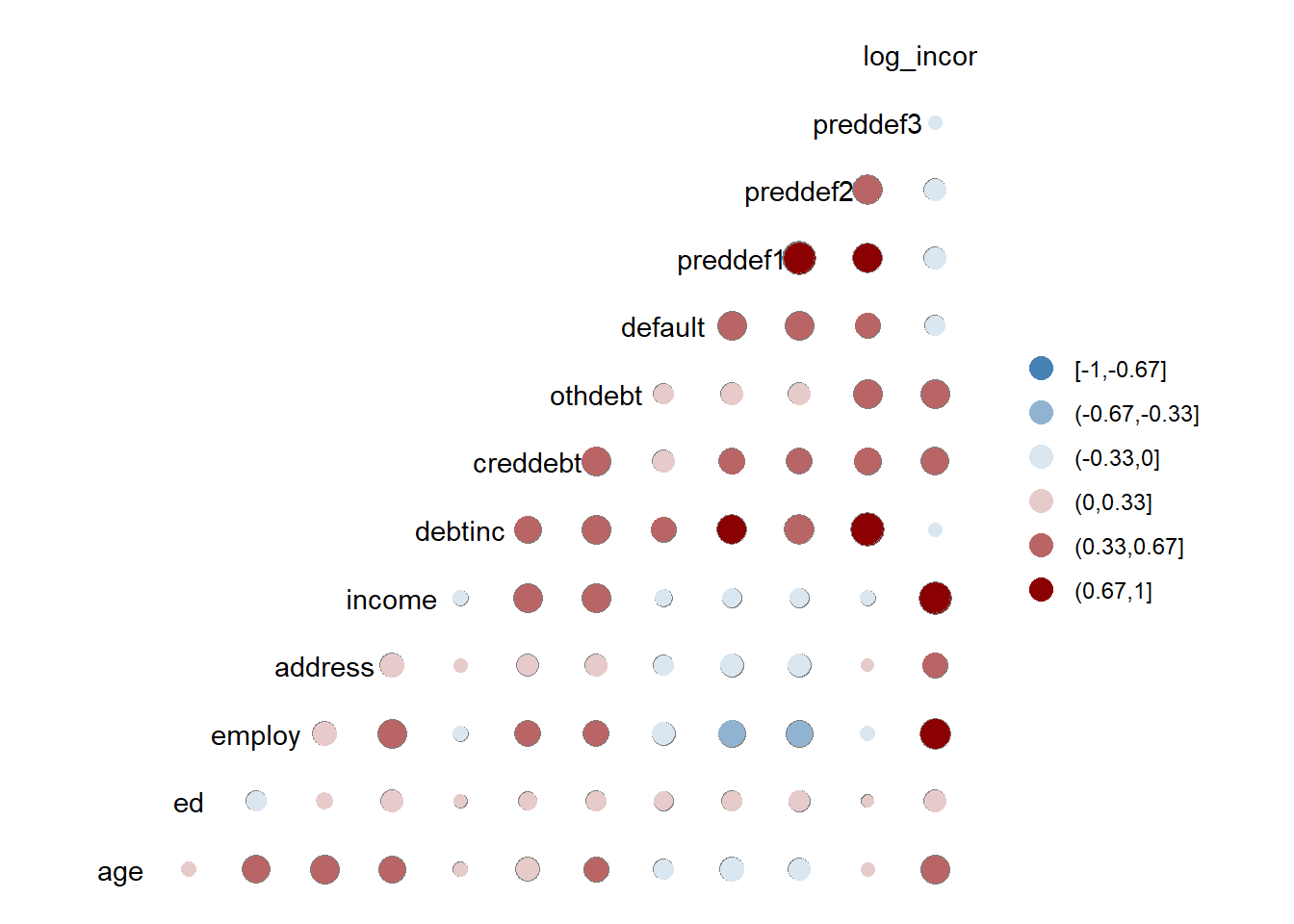 As you can see - the default correlation matrix is not the best idea for all measurement scales (including binary variable “default”).
That’s why now we can perform our bivariate analysis with ggpair with grouping.
Correlation matrix with scatterplots:
Here is what we are about to calculate: - The correlation matrix between age, log_income, employ, address, debtinc, creddebt, and othdebt variable grouped by whether the person has a default status or not. - Plot the distribution of each variable by group - Display the scatter plot with the trend by group
ggpairs(bank, columns = c("age", "log_income", "employ", "address", "debtinc", "creddebt", "othdebt"), title = "Bivariate analysis of customers' risk characteristics", upper = list(continuous = wrap("cor",
        size = 3)),
    lower = list(continuous = wrap("smooth",
        alpha = 0.3,
        size = 0.1)),
    mapping = aes(color = def))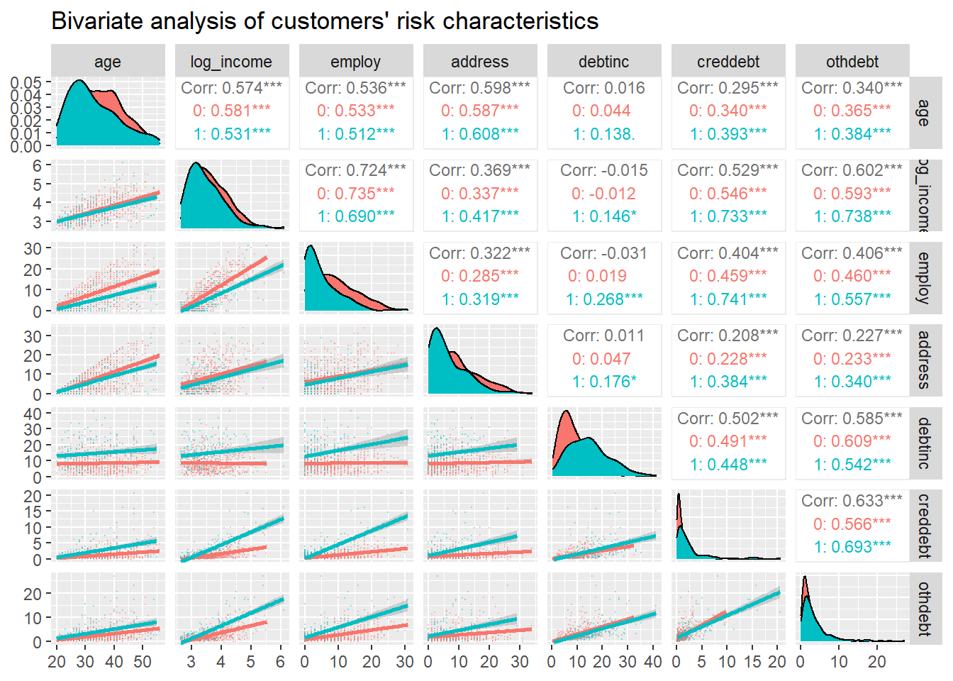
16.7 Qualitative pairs
When bivariate data results from two qualitative (attribute or categorical) variables, the data is often arranged on a cross-tabulation or contingency table.
16.7.1 Contingency table
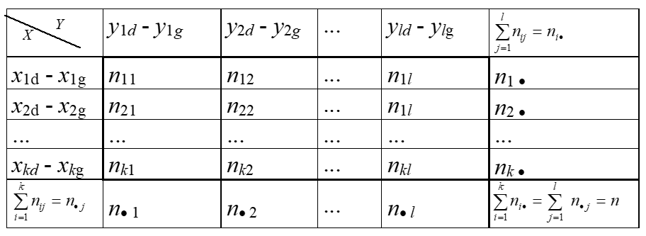
1st step: we have to transform and present our raw set of qualitative variables into the contingency table:
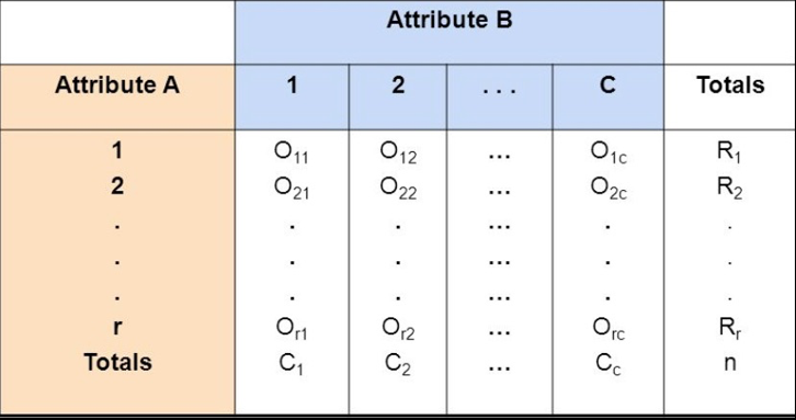
2nd step: we have to compare our observed frequencies in contingency table with the relative – “independent - expected” frequencies to check if there is any relationship between rows/columns frequencies – proportions.
Example: A survey was conducted to investigate the relationship between preferences for television, radio, or newspaper for national news, and gender. The results are given in the table below:

16.7.2 Chi-square statistic
The most popular method - “Chi-square” statistic based on Karl Pearson’s formula (1900) summarizing differences between OBSERVED and EXPECTED frequencies:

In the next step – based on Chi-square statistic we can calculate coefficient of qualitative correlation specified by many famous statisticians (Cramer’s V; Pearson’s C, Yule etc.). Be aware, that Chi-square statistic requires specific minimal frequencies and sizes of tables to be calculated properly.
If the frequencies in two-way table are really small (if 20 < N < 40 and if one of frequencies is lower than 5) then we must perform the continuity correction using Yate’s formula:
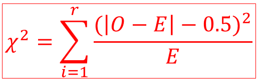
16.7.3 Mosaic plots
In our example we have to check the structure of frequency data (example - the Titanic disaster which provides a simple example of how to use the mosaic plots).
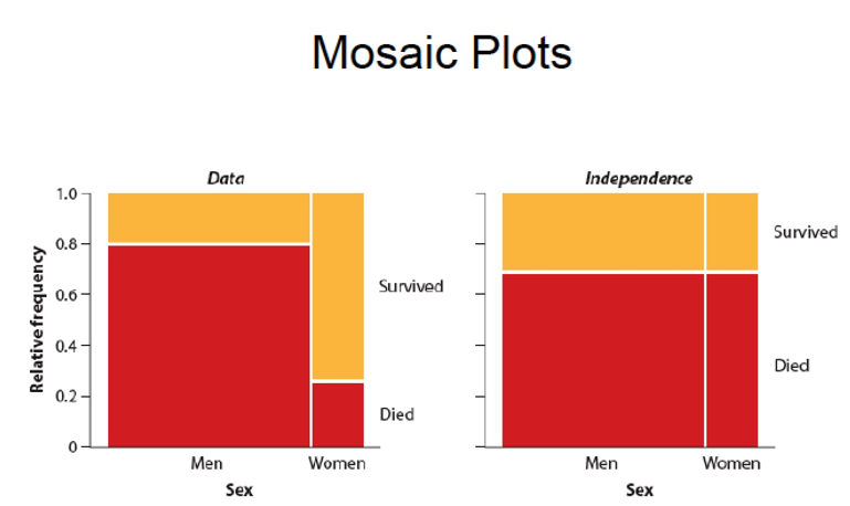
16.7.4 Pie charts
A pie chart is a circle divided into sectors that each represent a proportion of the whole. We can present qualitative data on the pie charts, but they have many disadvantages! The problem is that humans are pretty bad at reading angles. In the adjacent pie chart, try to figure out which group is the biggest one and try to order them by value. You will probably struggle to do so and this is why pie charts must be avoided:
Even if pie charts are bad by definition, it is still possible to make them even worse by adding other bad features:
- 3d
- legend aside
- percentages that do not sum to 100
- too many items
- exploded pie charts
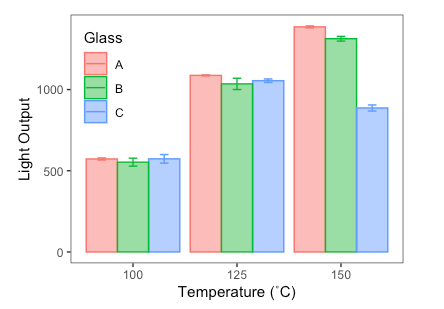
16.7.5 Barplots
The barplot is the best alternative to pie plots. Here is the example of 2 different scale variables compared on 2 barplots together:
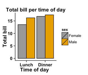
For 2 qualitative or categorical variables they may also be used:
16.7.6 Contingency correlations
To check the strength of the relationship between two qualitative variables we can transform Chi-square statistic into the specific correlation coefficient using several formulas.
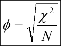
16.7.6.1 Yule’s phi
This coefficient is dedicated for 2x2 two-way tables only:
EXAMPLE: Do you believe in the Afterlife?
A survey was conducted and a random sample of 1091 questionnaires is given in the form of the following contingency table:
x=c(435,147,375,134)
dim(x)=c(2,2)
dane<-as.table(x)
dimnames(dane)=list(Gender=c('Female','Male'),Believe=c('Yes','No'))
dane
## Believe
## Gender Yes No
## Female 435 375
## Male 147 134Our task is to check if there is a significant relationship between the belief in the afterlife and gender. We can perform this procedure with the simple chi-square statistics and chosen qualitative correlation coefficient (two-way 2x2 table).
library(DescTools)
stats::chisq.test(x)
##
## Pearson's Chi-squared test with Yates' continuity correction
##
## data: x
## X-squared = 0.11103, df = 1, p-value = 0.739Phi(dane)## [1] 0.01218871As you can see we can calculate our chi-square statistic really quickly for 2x2 two-way tables or larger. Its value is 0.111. The corresponding Yule’s correlation coefficient is 0.012 - so there is no relationship between gender and the belief in the afterlife.
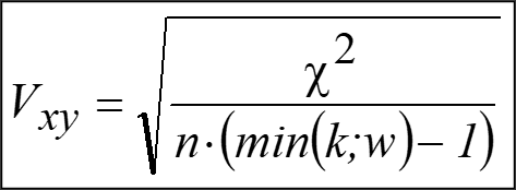
16.7.6.2 Cramer’s V
For larger tables (RowxColumn) – we should use the Cramer’s V coefficient:
EXAMPLE continued: Do you believe in the Afterlife?
Now we can standardize this contingency measure to see if the relationship is significant.
library(DescTools)
CramerV(dane)
## [1] 0.0121887116.7.6.3 Tschuprov’s T
Another very popular coefficient - Tschuprow’s T is a measure of association between two nominal variables, giving a value between 0 and 1 (inclusive). It is closely related to Cramér’s V, coinciding with it for square contingency tables. It was published by Alexander Tschuprow (alternative spelling: Chuprov) in 1939.
EXAMPLE continued: Do you believe in the Afterlife?
library(DescTools)
TschuprowT(dane)
## [1] 0.0121887116.7.6.4 Cohen’s Kappa
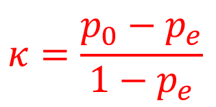
Cohen’s Kappa (𝛋) - also referred to as Cohen’s General Index of Agreement. It was originally developed to assess the degree of agreement between two judges or raters assessing n items on the basis of a nominal classification for 2 categories. Subsequent work by Fleiss and Light presented extensions of this statistic to more than 2 categories!
Cohen’s 𝛋 requires that we calculate two values: po : the proportion of cases in which agreement occurs; pe : the proportion of cases in which agreement would have been expected due purely to chance, based upon the marginal frequencies.
Cohen’s Kappa (𝛋) formula measures the agreement between two variables and is defined by:
In case of more than 2 categories we can use Fleiss’ Kappa:
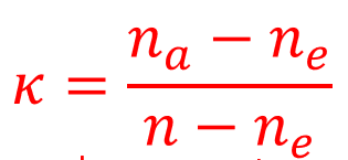
where: na – number of observed agreements, ne – number of expected agreements, n – sample size.
EXAMPLE continued: Do you believe in the Afterlife?
library(psych)
yes<-c(435,147)
no<-c(375,134)
cohen.kappa(cbind(yes,no))
## Call: cohen.kappa1(x = x, w = w, n.obs = n.obs, alpha = alpha, levels = levels)
##
## Cohen Kappa and Weighted Kappa correlation coefficients and confidence boundaries
## lower estimate upper
## unweighted kappa -0.043 0.011 0.065
## weighted kappa -0.043 0.011 0.065
##
## Number of subjects = 1091The corresponding Cohen’s kappa correlation coefficient is 0.011 - so there is no relationship between gender and the belief in the afterlife.
16.7.6.5 Fisher’s exact test
Fisher’s Exact Test is a test for independence in a 2X2 table. It is most useful when the total sample size and the expected values are small. The test holds the marginal totals fixed and computes the hypergeometric probability that n11 is at least as large as the observed value. Useful when E(cell counts) < 5.
EXAMPLE: Small sample case study
For our example, we want to determine whether there is a statistically significant association between smoking and being a professional athlete. Smoking can only be “yes” or “no” and being a professional athlete can only be “yes” or “no”. The two variables of interest are qualitative variables and we collected data on 14 persons.
Our data are summarized in the contingency table below reporting the number of people in each subgroup:
dat <- data.frame(
  "smoke_no" = c(7, 0),
  "smoke_yes" = c(2, 5),
  row.names = c("Athlete", "Non-athlete"),
  stringsAsFactors = FALSE
)
colnames(dat) <- c("Non-smoker", "Smoker")

dat
## Non-smoker Smoker
## Athlete 7 2
## Non-athlete 0 5Remember that the Fisher’s exact test is used when there is at least one cell in the contingency table of the expected frequencies below 5. To retrieve the expected frequencies, use the chisq.test() function together with $expected:
stats::chisq.test(dat)$expected## Non-smoker Smoker
## Athlete 4.5 4.5
## Non-athlete 2.5 2.5The contingency table above confirms that we should use the Fisher’s exact test instead of the Chi-square test because there is at least one cell below 5.
Tip: although it is a good practice to check the expected frequencies before deciding between the Chi-square and the Fisher test, it is not a big issue if you forget. As you can see above, when doing the Chi-square test in R (with chisq.test()), a warning such as “Chi-squared approximation may be incorrect” will appear. This warning means that the smallest expected frequencies is lower than 5. Therefore, do not worry if you forgot to check the expected frequencies before applying the appropriate test to your data, R will warn you that you should use the Fisher’s exact test instead of the Chi-square test if that is the case.
To perform the Fisher’s exact test in R, use the fisher.test() function as you would do for the Chi-square test:
test <- stats::fisher.test(dat)
test
##
## Fisher's Exact Test for Count Data
##
## data: dat
## p-value = 0.02098
## alternative hypothesis: true odds ratio is not equal to 1
## 95 percent confidence interval:
## 1.449481 Inf
## sample estimates:
## odds ratio
## InfFrom the output we see that the p-value is less than the significance level of 5%. Like any other statistical test, if the p-value is less than the significance level, we can reject the null hypothesis. If you are not familiar with p-values, I invite you to read the section related to statistical tests (Mathematical Statistics). In our context, rejecting the null hypothesis for the Fisher’s exact test of independence means that there is a significant relationship between the two categorical variables (smoking habits and being an athlete or not). Therefore, knowing the value of one variable helps to predict the value of the other variable.
16.8 Recreating data
It is easier to work with the package when our data is not already in the form of a contingency table so we transform it to a data frame before plotting the results:
# create dataframe from contingency table
x <- c()
for (row in rownames(dat)) {
  for (col in colnames(dat)) {
    x <- rbind(x, matrix(rep(c(row, col), dat[row, col]), ncol = 2, byrow = TRUE))
  }
}
df <- as.data.frame(x)
colnames(df) <- c("Sport_habits", "Smoking_habits")
df
## Sport_habits Smoking_habits
## 1 Athlete Non-smoker
## 2 Athlete Non-smoker
## 3 Athlete Non-smoker
## 4 Athlete Non-smoker
## 5 Athlete Non-smoker
## 6 Athlete Non-smoker
## 7 Athlete Non-smoker
## 8 Athlete Smoker
## 9 Athlete Smoker
## 10 Non-athlete Smoker
## 11 Non-athlete Smoker
## 12 Non-athlete Smoker
## 13 Non-athlete Smoker
## 14 Non-athlete SmokerNow we can provide many more analyses, work me large range of packages and functions. For example with package “ggstatsplot” that plots and prints the results of calculations:
# Fisher's exact test with raw data
test <- stats::fisher.test(table(df))

# combine plot and statistical test with ggbarstats
library(ggstatsplot)
ggbarstats(
  df, Smoking_habits, Sport_habits,
  results.subtitle = FALSE,
  subtitle = paste0(
    "Fisher's exact test", ", p-value = ",
    ifelse(test$p.value < 0.001, "< 0.001", round(test$p.value, 3))
  )
)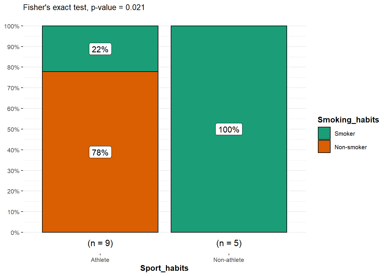
From the plot, it is clear that the proportion of smokers among non-athletes is higher than among athletes, suggesting that there is a relationship between the two variables.
This is confirmed thanks to the p-value displayed in the subtitle of the plot. As previously, we reject the null hypothesis and we conclude that the variables smoking habits and being an athlete or not are dependent (p-value = 0.021).