Introduction
“A picture is worth more than a thousand words…” In this section you will learn how to program professional graphics. We will discuss how to use layered graphing with the ggplot2 package.
The handbook R Graphics Cookbook, 2nd edition by Winston Chang might be very useful as well as the extension of this e-book’s tutorials.
ggplot2
The authors of this package say that “ggplot2 is a system for declaratively creating graphics, based on The Grammar of Graphics. You provide the data, tell ggplot2 how to map variables to aesthetics, what graphical primitives to use, and it takes care of the details”.
The easiest way to get ggplot2 is to install the whole tidyverse. Alternatively, install just ggplot2.
Very, very helpful is the ggplot2 cheat-sheet!
It’s hard to succinctly describe how ggplot2 works because it embodies a deep philosophy of visualisation. However, in most cases you start with ggplot(), supply a dataset and aesthetic mapping (with aes()). You then add on layers (like geom_point() or geom_histogram()), scales (like scale_colour_brewer()), faceting specifications (like facet_wrap()) and coordinate systems (like coord_flip()).
8.3.1 Syntax
The main difference is that, unlike base graphics, ggplot works with dataframes and not individual vectors. All the data needed to make the plot is typically be contained within the dataframe supplied to the ggplot() itself or can be supplied to respective geoms.
First, you need to initialize a basic ggplot based on the chosen dataset. Let’s use the “mtcars” dataset :-) We can just prepare here the axis for miles per galon (mpg) variable vs. horsepower (hp):
options(scipen=999) # turn off scientific notation like 1e+06
library(ggplot2)
data("mtcars") # load the data
# Init Ggplot
ggplot(mtcars, aes(x=mpg, y=hp)) 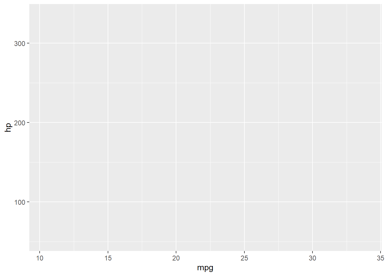 A blank ggplot is drawn. Even though the x and y are specified, there are no points or lines in it. This is because, ggplot doesn’t assume that you meant a scatterplot or a line chart to be drawn. I have only told ggplot what dataset to use and what columns should be used for X and Y axis. I haven’t explicitly asked it to draw any points.
Also note that aes() function is used to specify the X and Y axes. That’s because, any information that is part of the source dataframe has to be specified inside the aes() function.
Let’s make a scatterplot on top of the blank ggplot by adding points using a geom layer called geom_point.
# Setup
options(scipen=999)  # turn off scientific notation like 1e+06
library(ggplot2)
data("mtcars")  # load the data

# Init Ggplot
ggplot(mtcars, aes(x=mpg, y=hp))  +
  geom_point()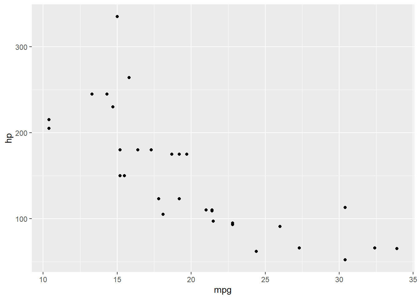
We got a basic scatterplot, where each point represents a county. However, it lacks some basic components such as the plot title, meaningful axis labels etc.
Let’s just add a smoothing layer using geom_smooth(method=‘lm’). Since the method is set as lm (short for linear model), it draws the line of best fit.
# Setup
options(scipen=999)  # turn off scientific notation like 1e+06
library(ggplot2)
data("mtcars")  # load the data

# Init Ggplot
ggplot(mtcars, aes(x=mpg, y=hp))  +
  geom_point() +
  geom_smooth(method="lm")
## `geom_smooth()` using formula 'y ~ x'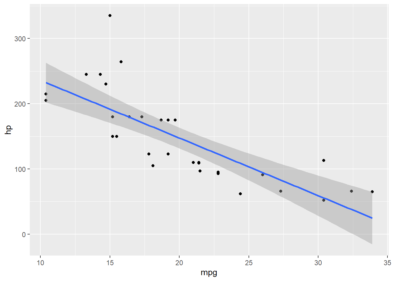
The line of best fit is in blue. Can you find out what other method options are available for geom_smooth? (note: see ?geom_smooth).
Please go through the next sections to see how to adjust axis, other dimensions, labels, titles etc. - all options that are available in the ggplot2 objects. The cheat-sheet might be also very useful here.