Chapter 20 Time Series
20.1 Univariate Time Series Analysis
Any metric that is measured over regular time intervals forms a time series.
Analysis of time series is commercially importance because of industrial need and relevance especially w.r.t forecasting (demand, sales, supply etc).
A time series can be broken down to its components so as to systematically understand, analyze, model and forecast it.
In this chapter we will answer the following questions:
What are the components of a time series?
What is a stationary time series?
How to decompose it?
How to de-trend, de-seasonalize a time series?
What is autocorrelation?
20.2 Time series data
A time series is stored in a ts object in R:
- a list of numbers
- information about times those numbers were recorded.
ts(data, frequency, start)
Once you have read the time series data into R, the next step is to store the data in a time series object in R, so that you can use many functions for analyzing time series data. To store the data in a time series object, we use the ts() function in R.
For example, to store the data in the variable tsales as a time series object in R, we type:
# Creating a time series object in R
sales <- c(18, 33, 41,  7, 34, 35, 24, 25, 24, 21, 25, 20,
           22, 31, 40, 29, 25, 21, 22, 54, 31, 25, 26, 35)
tsales <- ts(sales, start=c(2003, 1), frequency=12)
tsales
Jan Feb Mar Apr May Jun Jul Aug Sep Oct Nov
2003 18 33 41 7 34 35 24 25 24 21 25
2004 22 31 40 29 25 21 22 54 31 25 26
Dec
2003 20
2004 35Sometimes the time series data set that you have may have been collected at regular intervals that were less than one year, for example, monthly or quarterly. In this case, you can specify the number of times that data was collected per year by using the frequency parameter in the ts() function. For monthly time series data, you set frequency=12, while for quarterly time series data, you set frequency=4.
You can also specify the first year that the data was collected, and the first interval in that year by using the start parameter in the ts() function. For example, if the first data point corresponds to the second quarter of 2003, you would set start=c(2003,2).
tsales <- ts(sales, start=c(2003, 2), frequency=4)
tsales
Qtr1 Qtr2 Qtr3 Qtr4
2003 18 33 41
2004 7 34 35 24
2005 25 24 21 25
2006 20 22 31 40
2007 29 25 21 22
2008 54 31 25 26
2009 35 start(tsales) [1] 2003 2end(tsales)[1] 2009 1frequency(tsales)[1] 420.3 Smoothing a Time Series
Solution
The KernSmooth package contains functions for smoothing. Use the
dpill function to select an initial bandwidth parameter, and then use the
locploy function to smooth the data:
Here, t is the time variable and y is the time series.
Discussion
The KernSmooth package is a standard part of the R distribution. It
includes the locpoly function, which constructs, around each
data point, a polynomial that is fitted to the nearby data points.
These are called local polynomials. The local polynomials are strung
together to create a smoothed version of the original data series.
The algorithm requires a bandwidth parameter to control the degree of smoothing. A small bandwidth means less smoothing, in which case the result follows the original data more closely. A large bandwidth means more smoothing, so the result contains less noise. The tricky part is choosing just the right bandwidth: not too small, not too large.
Fortunately, KernSmooth also includes the function dpill for
estimating the appropriate bandwidth, and it works quite well.
We recommend that you start with the dpill value and then experiment with
values above and below that starting point. There is no magic formula
here. You need to decide what level of smoothing works best in your
application.
The following is an example of smoothing. We’ll create some example data that is the sum of a simple sine wave and normally distributed “noise”:
Both dpill and locpoly require a grid size—in other words, the number of
points for which a local polynomial is constructed.
We often use a grid size equal to the number of data points, which yields a fine resolution.
The resulting time series is very smooth. You might use a smaller grid
size if you want a coarser resolution or if you have a very large
dataset:
The locpoly function performs the smoothing and returns a list. The
y element of that list is the smoothed data:
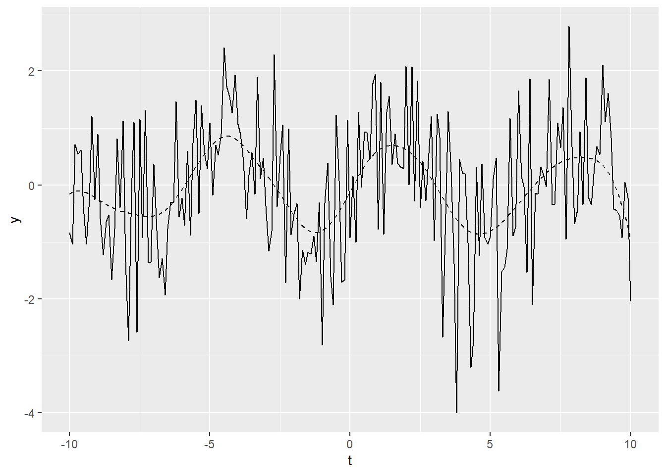
Figure 20.1: Example time series plot
In Figure 20.1, the smoothed data is shown
as a dashed line, while the solid line is our original example data. The figure demonstrates that locpoly did an
excellent job of extracting the original sine wave.
20.4 TS plots
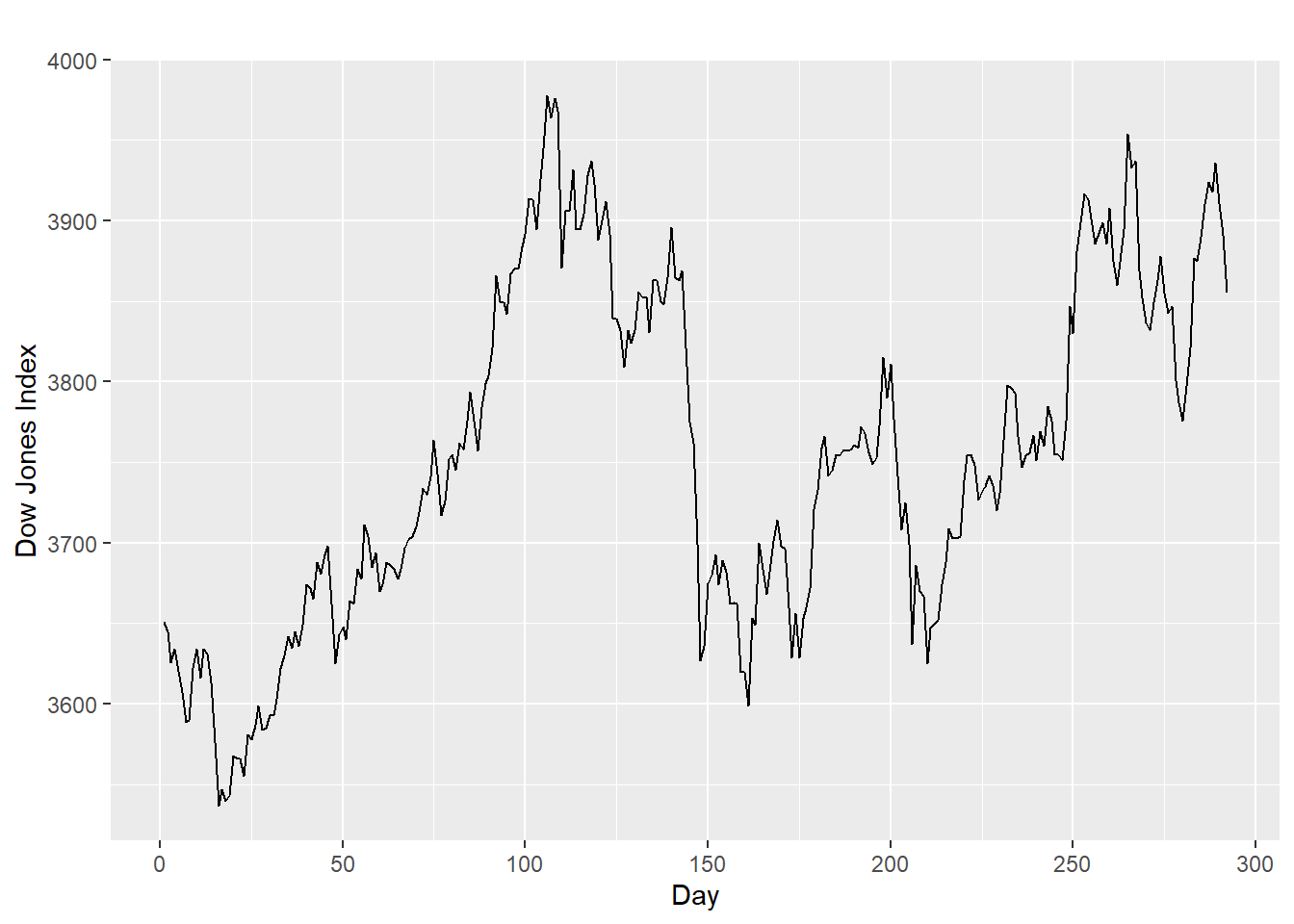
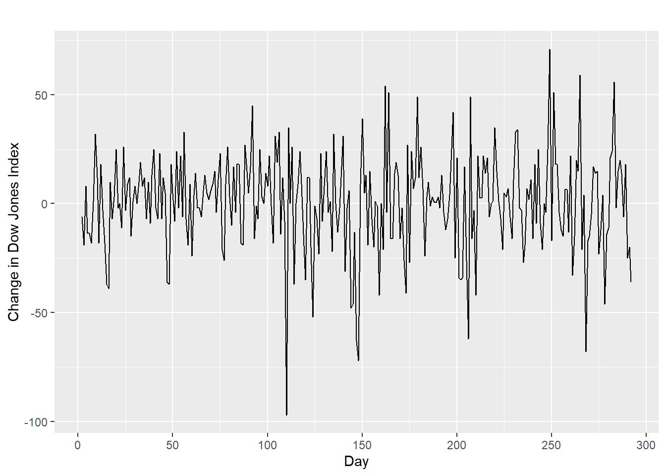
Once you have read a time series into R, the next step is usually to make a plot of the time series data, which you can do with the plot.ts() function in R.
plot.ts(tsales)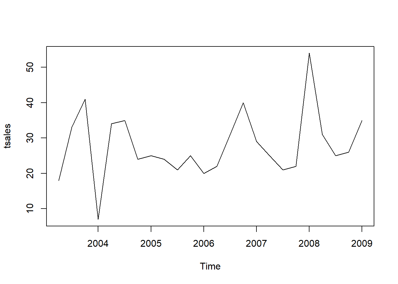
We can also take a look at some more detailed time series aspects like seasonal plots, i.e. for antidiabetic drug sales data:
ggseasonplot(a10, year.labels=TRUE, year.labels.left=TRUE) +
  ylab("$ million") +
  ggtitle("Seasonal plot: antidiabetic drug sales")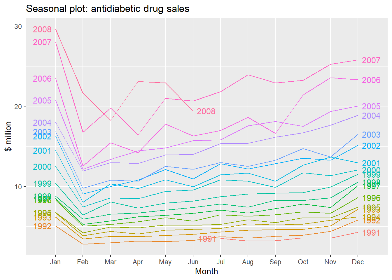
Seasonal polar plots:
ggseasonplot(a10, polar=TRUE) + ylab("$ million")+
  ggtitle("Seasonal polar plot: antidiabetic drug sales")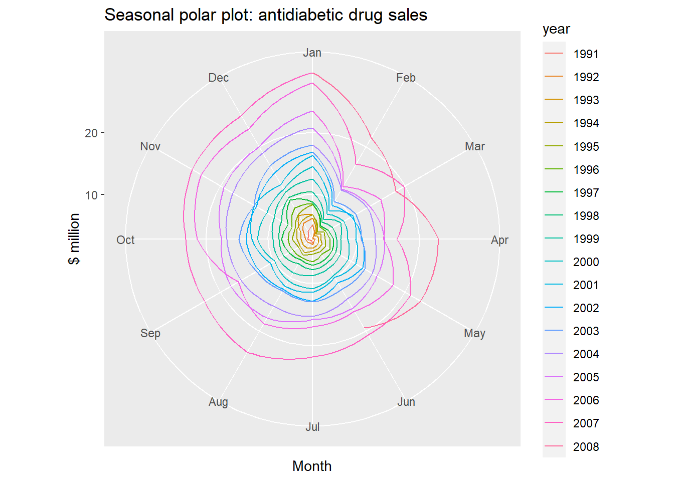
Seasonal subseries plots:
- Data for each season collected together in time plot as separate time series.
- Enables the underlying seasonal pattern to be seen clearly, and changes in seasonality over time to be visualized.
- In R:
ggsubseriesplot()
ggsubseriesplot(a10) + ylab("$ million") +
  ggtitle("Subseries plot: antidiabetic drug sales")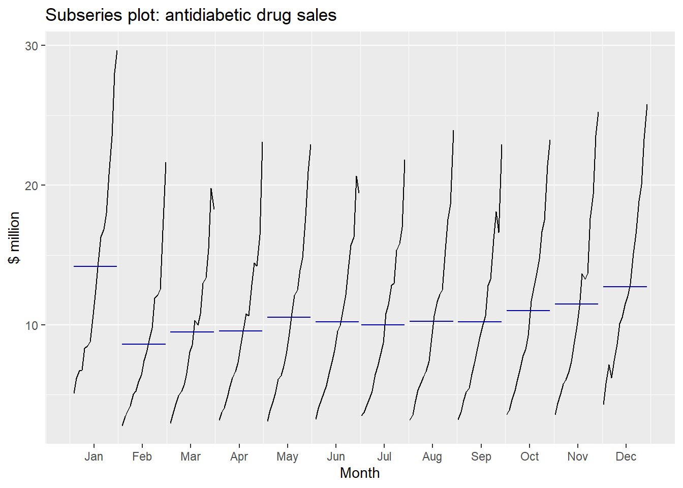
Lagged scatterplots:
Each graph shows \(y_t\) plotted against \(y_{t-k}\) for different values of \(k\).
The autocorrelations are the correlations associated with these scatterplots.
Each graph shows \(y_t\) plotted against \(y_{t-k}\) for different values of \(k\).
The autocorrelations are the correlations associated with these scatterplots.
beer <- window(ausbeer, start=1992)
gglagplot(beer)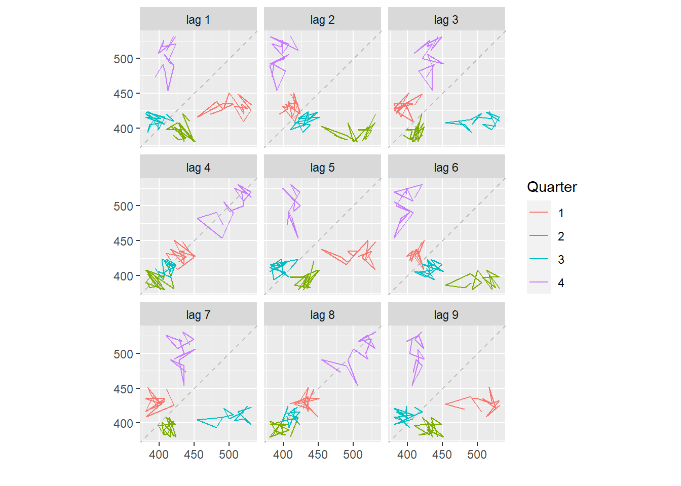
Here the colours indicate the quarter of the variable on the vertical axis.
The lines connect points in chronological order.
The window() function used here is very useful when extracting a portion of a time series. In this case, we have extracted the data from ausbeer, beginning in 1992.
20.5 Time series components
- Trend
-
pattern exists when there is a long-term increase or decrease in the data.
- Seasonal
-
pattern exists when a series is influenced by seasonal factors (e.g., the quarter of the year, the month, or day of the week).
- Cyclic
-
pattern exists when data exhibit rises and falls that are (duration usually of at least 2 years).
Additive decomposition: \(y_t = S_t + T_t + R_t.\)
Multiplicative decomposition: \(y_t = S_t \times T_t \times R_t.\)
- Additive model appropriate if magnitude of seasonal fluctuations does not vary with level.
- If seasonal are proportional to level of series, then multiplicative model appropriate.
- Multiplicative decomposition more prevalent with economic series
- Alternative: use a Box-Cox transformation, and then use additive decomposition.
- Logs turn multiplicative relationship into an additive relationship:
\[y_t = S_t \times T_t \times E_t \quad\Rightarrow\quad \log y_t = \log S_t + \log T_t + \log R_t. \]
20.6 Moving averages
- The first step in a classical decomposition is to use a moving average method to estimate the trend-cycle.
- A moving average of order \(m\) can be written as \[\hat{T}_t = \frac{1}{m}\sum_{j=-k}^k y_{t+j}\] where \(m=2k+1\). We call this an \(m\)-MA.
- The estimate of the trend-cycle at time \(t\) is obtained by averaging values of the time series within \(k\) periods of \(t\). Observations that are nearby in time are also likely to be close in value.
20.6.1 MA’s of MA’s
*Moving averages of moving averages
\(m\) can be even but the moving average would no longer be symmetric
It is possible to apply a moving average to a moving average. One reason for doing this is to make an even-order moving average symmetric.
When a 2-MA follows a moving average of an even order (such as 4), it is called a centered moving average of order 4 written as \(2\times 4\)-MA.
\[\hat{T}_t = \frac{1}{2}\left[\frac{1}{4}(y_{t-2}+y_{t-1}+y_t+y_{t+1})+\frac{1}{4}(y_{t-1}+y_{t}+y_{t+1}+y_{t+2})\right] \]
It is now a weighted average of observations that is symmetric.
20.6.2 Trend-cycle with seasonal data
The most common use of centred moving averages is for estimating the trend-cycle from seasonal data.
For quarterly data, we can use \(2\times 4\)-MA \[\hat{T}_t = \frac{1}{8}y_{t-2}+\frac{1}{4}y_{t-1}+\frac{1}{4}y_t +\frac{1}{4}y_{t+1}+\frac{1}{8}y_{t+2}\]
Consequently, the seasonal variation will be averaged out and the resulting values of \(\hat{T}_t\) will have little or no seasonal variation remaining.
For monthly data, we can use \(2\times 12\)-MA to estimate the trend-cycle.
For weekly data, we can use \(7\)-MA.
20.7 Decomposing Non-Seasonal Data
Decomposing a time series means separating it into its constituent components, which are usually a trend component and an irregular component, and if it is a seasonal time series, a seasonal component.
A non-seasonal time series consists of a trend component and an irregular component. Decomposing the time series involves trying to separate the time series into these components, that is, estimating the the trend component and the irregular component.
To estimate the trend component of a non-seasonal time series that can be described using an additive model, it is common to use a smoothing method, such as calculating the simple moving average of the time series.
The SMA() function in the TTR R package can be used to smooth time series data using a simple moving average. To use this function, we first need to install the TTR R package.
You can then use the SMA() function to smooth time series data. To use the SMA() function, you need to specify the order (span) of the simple moving average, using the parameter n.
For example, to calculate a simple moving average of order 3, we set n=5 in the SMA() function:
moving1 <- SMA(tsales,n=3)
plot.ts(moving1)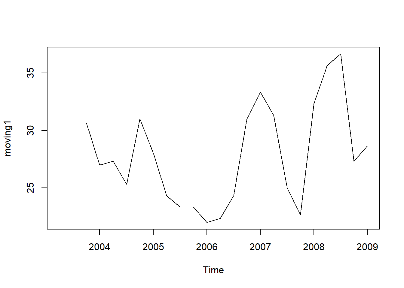
There still appears to be quite a lot of random fluctuations in the time series smoothed using a simple moving average of order 3. Thus, to estimate the trend component more accurately, we might want to try smoothing the data with a simple moving average of a higher order.
moving2 <- SMA(tsales,n=5)
plot.ts(moving2)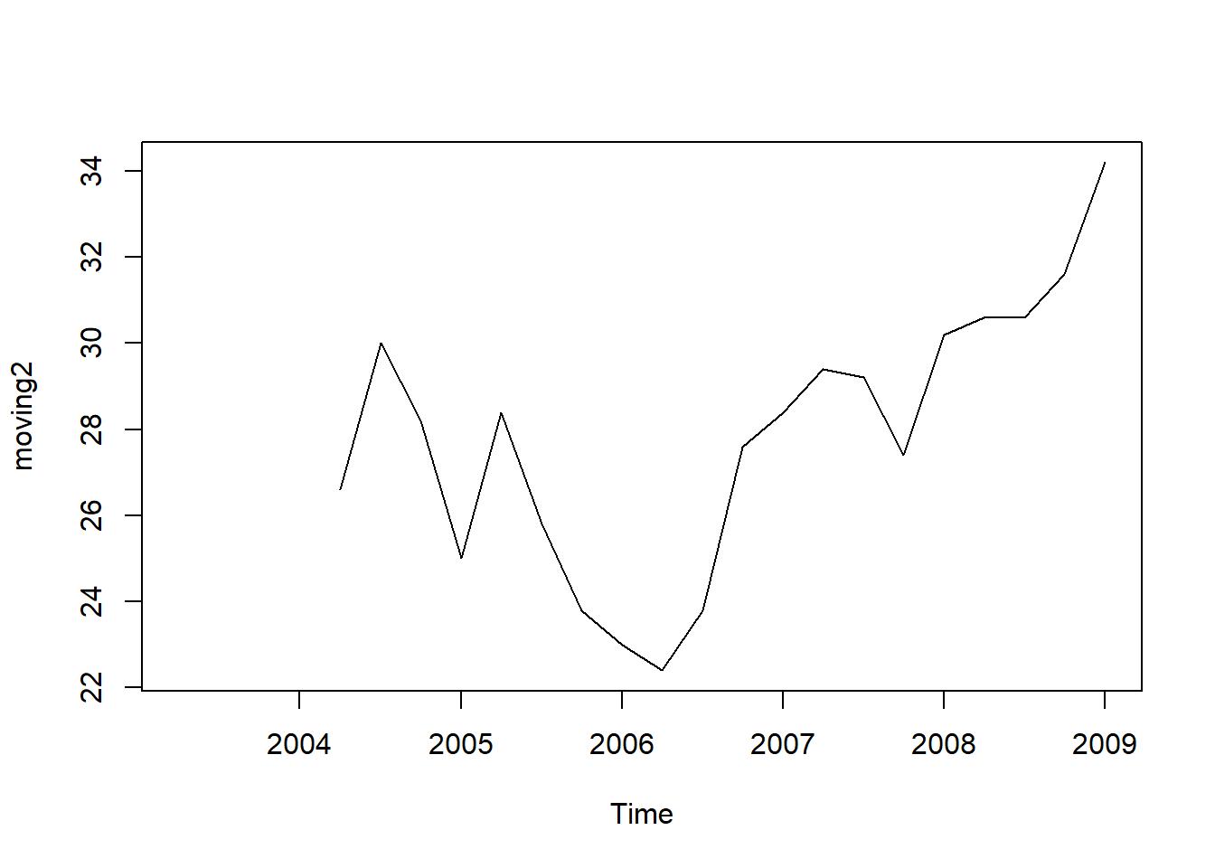
The data smoothed with a simple moving average of order 5 gives a clearer picture of the trend component.
20.8 Classical decomposition
A seasonal time series consists of a trend component, a seasonal component and an irregular component. Decomposing the time series means separating the time series into these three components: that is, estimating these three components.
- There are two forms of classical decomposition: an additive decomposition and a multiplicative decomposition.
- Let \(m\) be the seasonal period.
Additive decomposition: \(y_t = S_t + T_t + R_t.\)
Multiplicative decomposition: \(y_t = S_t \times T_t \times R_t.\)
20.8.1 Classical additive decomposition
Step 1: If is an even number, compute the trend-cycle component \(\hat{T}_t\) using \(2 \times m\)-MA. If \(m\) is an odd number, use \(m\)-MA.
Step 2: Calculate the detrended series: \(T_t-\hat{T}_t\).
Step 3: To estimate the seasonal component for each season, simply average the detrended values for that season.
Step 4: The remainder component is calculated by subtracting the estimated seasonal and trend-cycle components.
A classical multiplicative decomposition is very similar, except that the subtractions are replaced by divisions.
- The trend-cycle estimate tends to over-smooth rapid rises and falls in the data.
- Classical decomposition methods assume that the seasonal component repeats from year to year. For many series, this is a reasonable assumption, but for some longer series it is not.
- The classical method is not robust to unusual values.
To estimate the trend component and seasonal component of a seasonal time series that can be described using an additive model, we can use the decompose() function in R. This function estimates the trend, seasonal, and irregular components of a time series that can be described using an additive model.
The function decompose() returns a list object as its result, where the estimates of the seasonal component, trend component and irregular component are stored in named elements of that list objects, called seasonal, trend, and random respectively.
Likewise, to plot the time series of antidiabetic drug sales, we type:
autoplot(a10) + ylab("$ million") + xlab("Year") +
         ggtitle("Antidiabetic drug sales")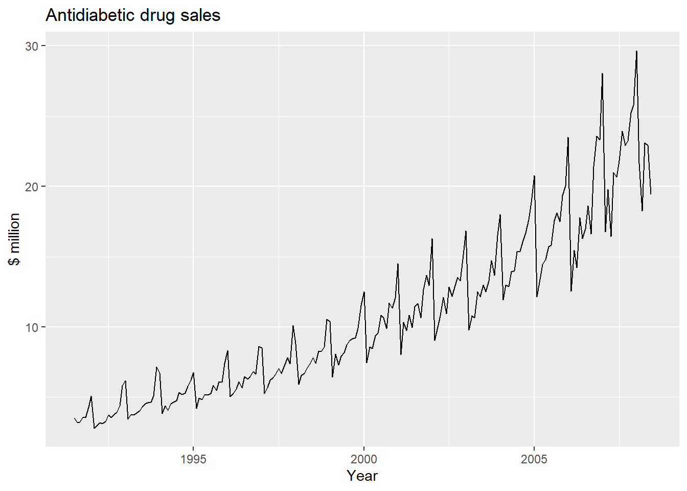
We can see from this time series that there seems to be seasonal variation in the number of births per month: there is a peak every summer, and a trough every winter.
Again, it seems that this time series could probably be described using an additive model, as the seasonal fluctuations are roughly constant in size over time and do not seem to depend on the level of the time series, and the random fluctuations also seem to be roughly constant in size over time.
Similarly, to plot the time series of the monthly sales for the souvenir shop at a beach resort, we type:
plot.ts(souvenirtimeseries)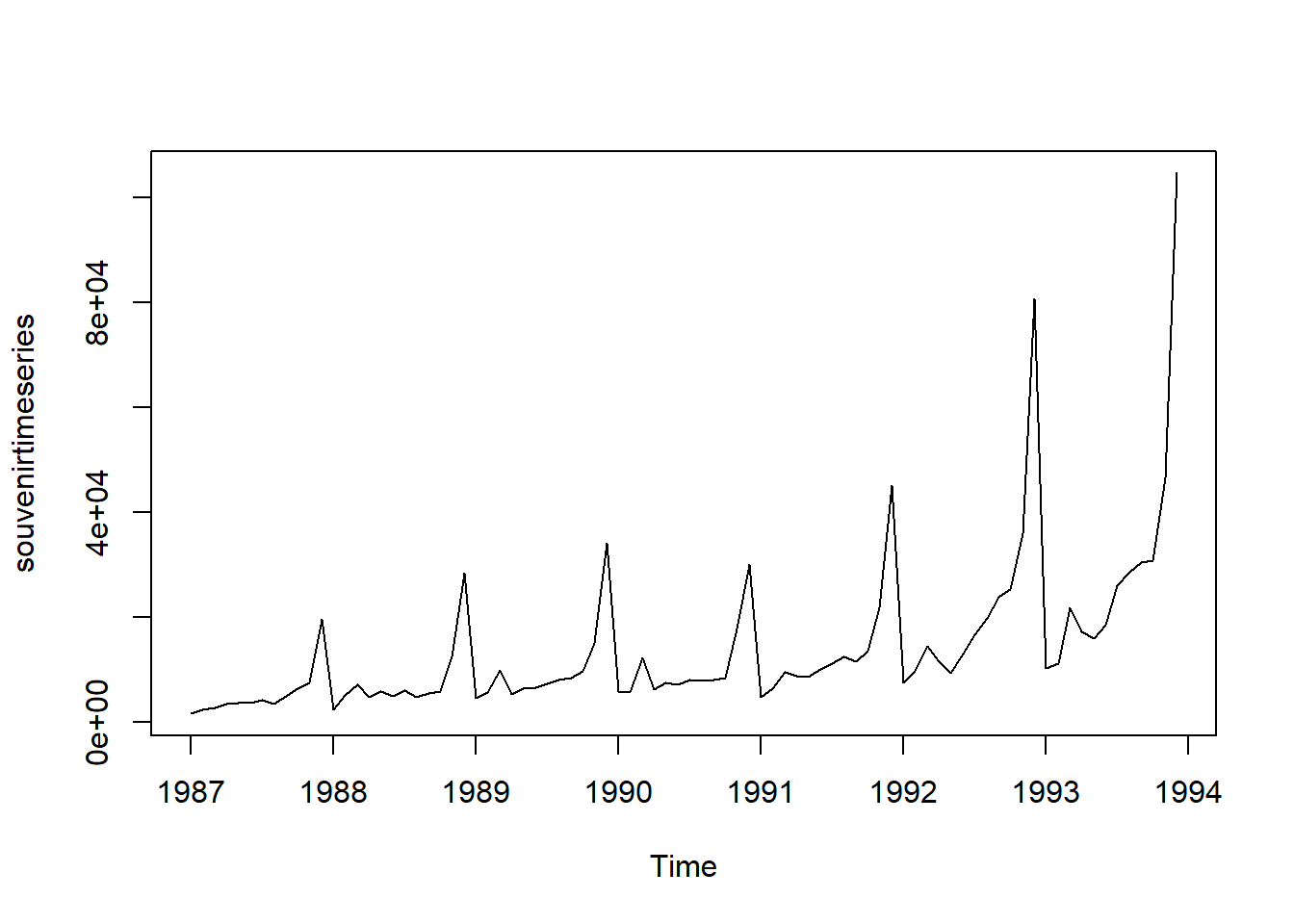
In this case, it appears that an additive model is not appropriate for describing this time series, since the size of the seasonal fluctuations and random fluctuations seem to increase with the level of the time series.
Thus, we may need to transform the time series in order to get a transformed time series that can be described using an additive model. For example, we can transform the time series by calculating the natural log of the original data:
logsouvenirtimeseries <- as.ts(log(souvenirtimeseries))
plot.ts(logsouvenirtimeseries)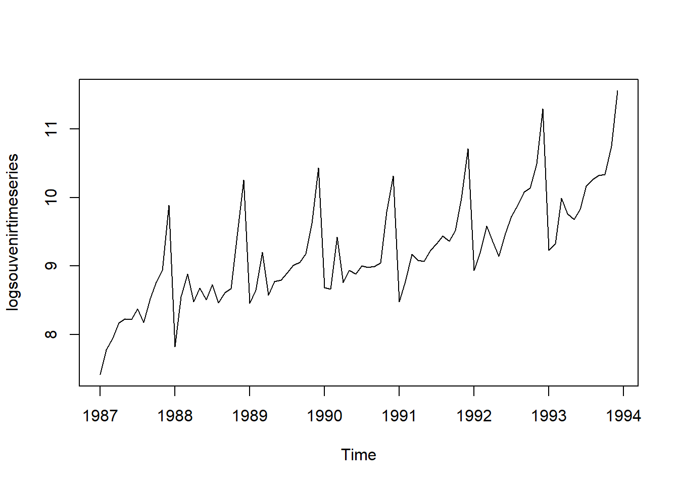
Here we can see that the size of the seasonal fluctuations and random fluctuations in the log-transformed time series seem to be roughly constant over time, and do not depend on the level of the time series. Thus, the log-transformed time series can probably be described using an additive model:
decomposed1 <- decompose(logsouvenirtimeseries)
plot(decomposed1)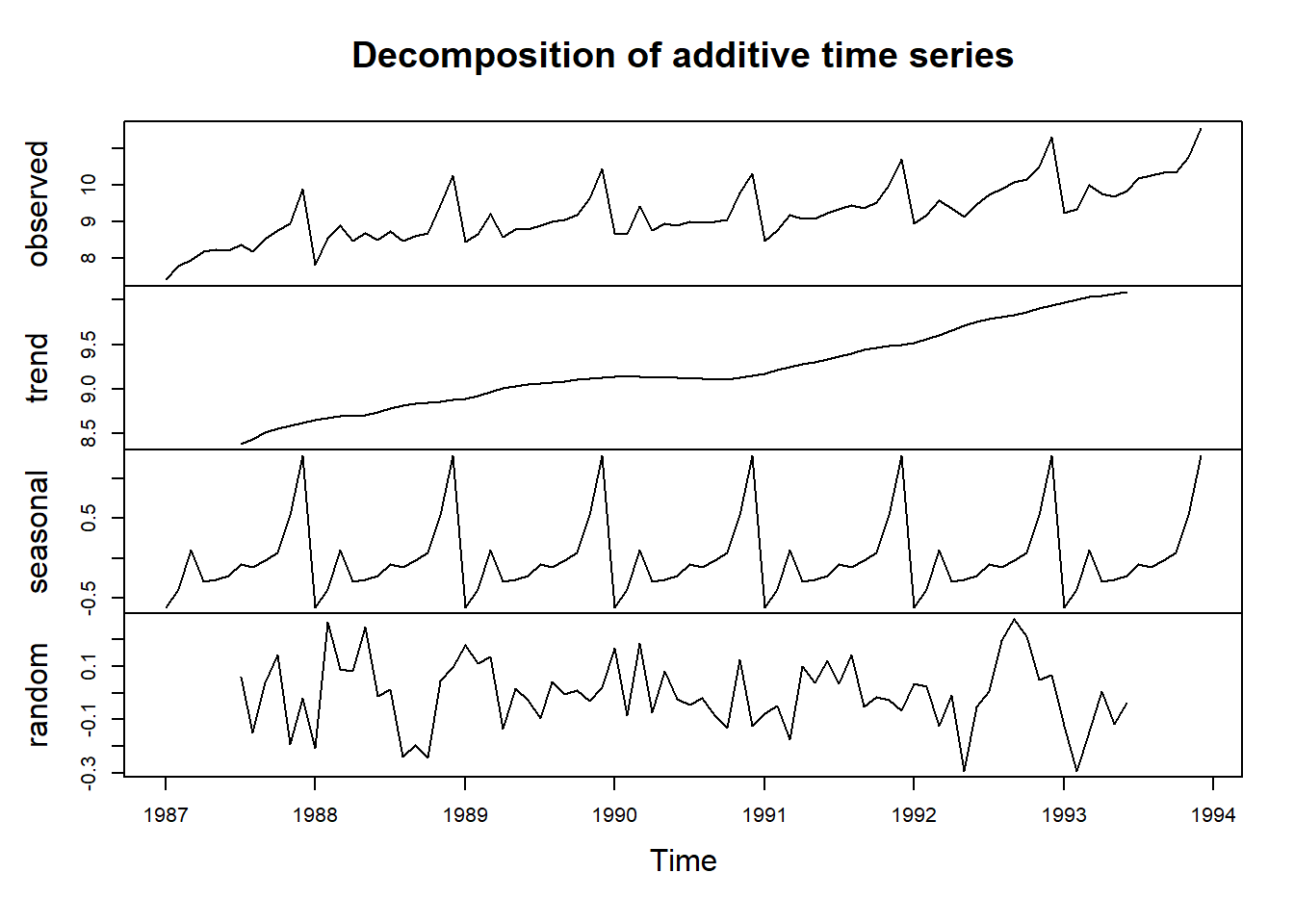
While classical decomposition is still widely used, it is not recommended, as there are now several much better methods.
Some of the problems with classical decomposition are summarized below:
The estimate of the trend-cycle is unavailable for the first few and last few observations. For example, if m=12, there is no trend-cycle estimate for the first six or the last six observations. Consequently, there is also no estimate of the remainder component for the same time periods.
The trend-cycle estimate tends to over-smooth rapid rises and falls in the data.
Classical decomposition methods assume that the seasonal component repeats from year to year. For many series, this is a reasonable assumption, but for some longer series it is not. For example, electricity demand patterns have changed over time as air conditioning has become more widespread. In many locations, the seasonal usage pattern from several decades ago had its maximum demand in winter (due to heating), while the current seasonal pattern has its maximum demand in summer (due to air conditioning). Classical decomposition methods are unable to capture these seasonal changes over time.
Occasionally, the values of the time series in a small number of periods may be particularly unusual. For example, the monthly air passenger traffic may be affected by an industrial dispute, making the traffic during the dispute different from usual. The classical method is not robust to these kinds of unusual values.
20.9 X11 decomposition
The X-11 method originated in the US Census Bureau and was further developed by Statistics Canada.
It is based on classical decomposition, but includes many extra steps and features in order to overcome the drawbacks of classical decomposition that were discussed in the previous section.
In particular, trend-cycle estimates are available for all observations including the end points, and the seasonal component is allowed to vary slowly over time. X-11 also handles trading day variation, holiday effects and the effects of known predictors.
There are methods for both additive and multiplicative decomposition. The process is entirely automatic and tends to be highly robust to outliers and level shifts in the time series.
fit <- seas(a10, x11="")
autoplot(fit) +
ggtitle("X11 decomposition of antidiabetic drug sales")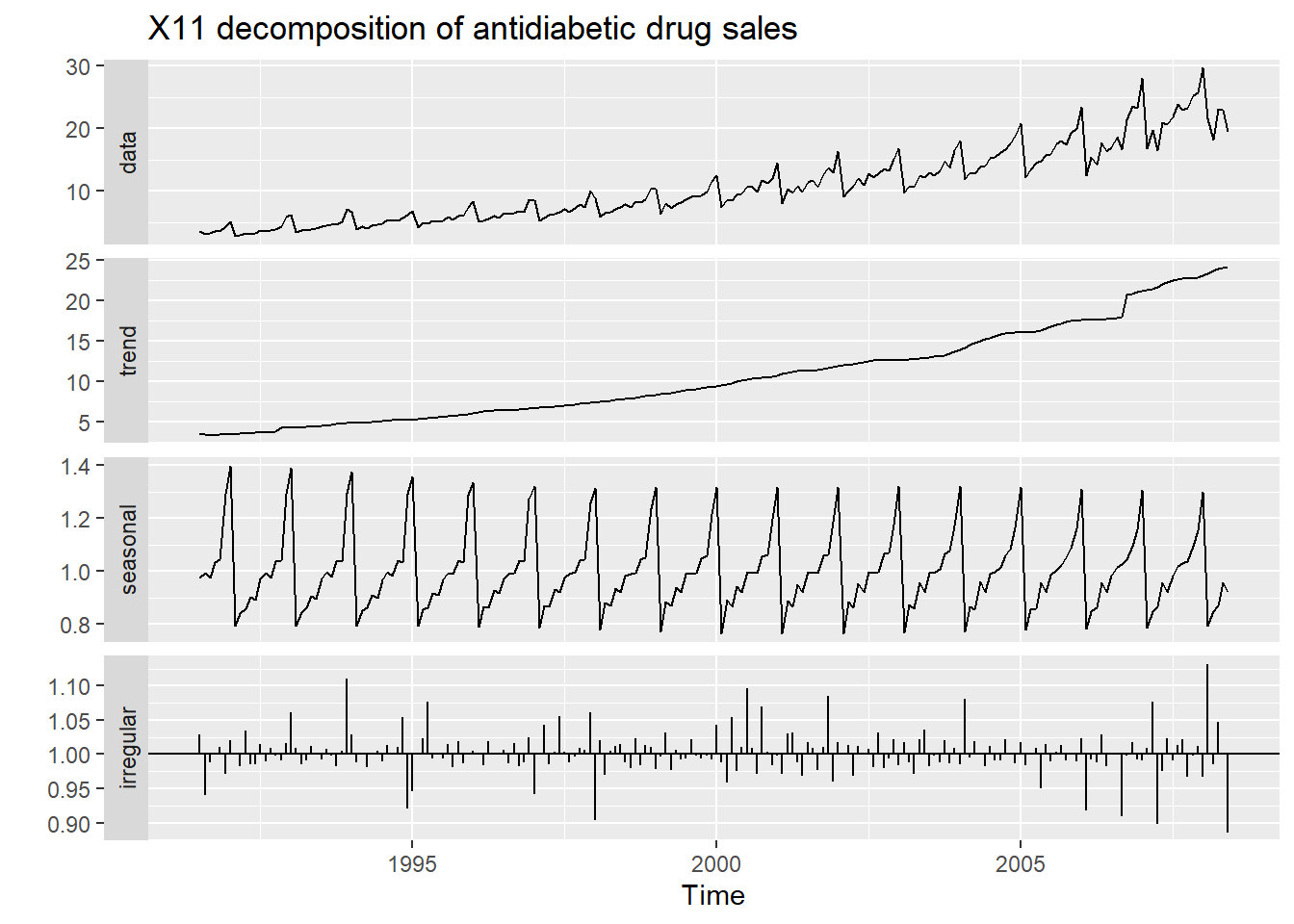
Advantages
- Relatively robust to outliers
- Completely automated choices for trend and seasonal changes
- Very widely tested on economic data over a long period of time.
Disadvantages
- No prediction/confidence intervals
- Ad hoc method with no underlying model
- Only developed for quarterly and monthly data
20.10 STL decomposition
STL is a versatile and robust method for decomposing time series. STL is an acronym for Seasonal and Trend decomposition using Loess, while Loess is a method for estimating nonlinear relationships.
STL has several advantages over the classical, SEATS and X11 decomposition methods:
Unlike SEATS and X11, STL will handle any type of seasonality, not only monthly and quarterly data.
The seasonal component is allowed to change over time, and the rate of change can be controlled by the user.
The smoothness of the trend-cycle can also be controlled by the user.
It can be robust to outliers (i.e., the user can specify a robust decomposition), so that occasional unusual observations will not affect the estimates of the trend-cycle and seasonal components. They will, however, affect the remainder component.
On the other hand, STL has some disadvantages: In particular, it does not handle day or calendar variation automatically, and it only provides facilities for additive decompositions.
tsales %>%
  stl(t.window=13, s.window="periodic", robust=TRUE) %>%
  autoplot()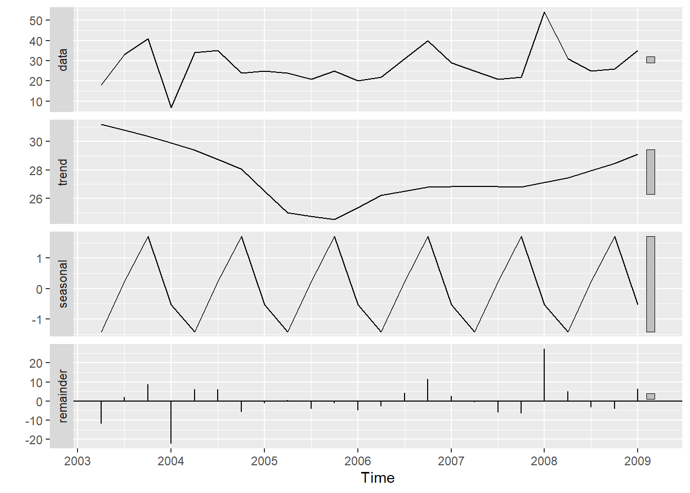
The two main parameters to be chosen when using STL are the trend-cycle window (t.window) and the seasonal window (s.window). These control how rapidly the trend-cycle and seasonal components can change. Smaller values allow for more rapid changes. Both t.window and s.window should be odd numbers; t.window is the number of consecutive observations to be used when estimating the trend-cycle; s.window is the number of consecutive years to be used in estimating each value in the seasonal component. The user must specify s.window as there is no default. Setting it to be infinite is equivalent to forcing the seasonal component to be periodic (i.e., identical across years). Specifying t.window is optional, and a default value will be used if it is omitted.
The mstl() function provides a convenient automated STL decomposition using s.window=13, and t.window also chosen automatically. This usually gives a good balance between overfitting the seasonality and allowing it to slowly change over time. But, as with any automated procedure, the default settings will need adjusting for some time series.
20.11 Seasonal Adjustments
If you have a seasonal time series that can be described using an additive model, you can seasonally adjust the time series by estimating the seasonal component, and subtracting the estimated seasonal component from the original time series. We can do this using the estimate of the seasonal component calculated by the decompose() function.
If the seasonal component (St) is removed from the original data, the resulting values are called the seasonally adjusted data. For an additive model, the seasonally adjusted data are given by yt-St, and for multiplicative data, the seasonally adjusted values are obtained using yt/St.
# Subtract St from yt to obtain seasonally adjusted time series:
decomposed1 <- decompose(logsouvenirtimeseries)
logsouvadjusted <- logsouvenirtimeseries - decomposed1$seasonal

autoplot(logsouvenirtimeseries) + xlab("Year") + ylab("Souv Sales") + ggtitle("Seasonally Adjust Souv Sales") +
  autolayer(logsouvenirtimeseries,series="Unadjusted Series") +
  autolayer(logsouvadjusted,lwd=1.2,series="Seasonally Adjusted") +
  guides(colour=guide_legend(title="Series"))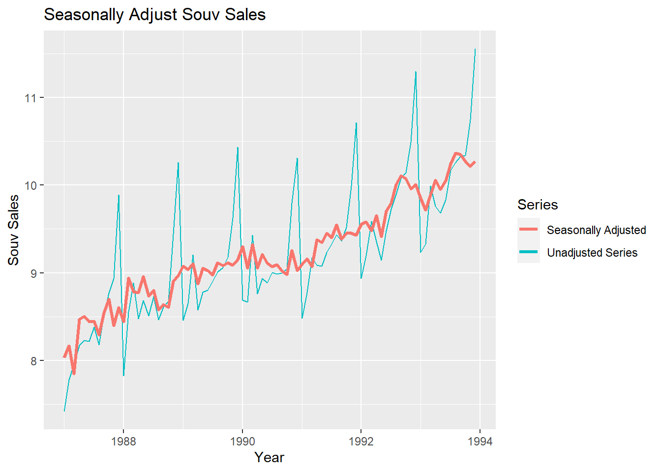
You can see that the seasonal variation has been removed from the seasonally adjusted time series. The seasonally adjusted time series now just contains the trend component and an irregular component.
If the variation due to seasonality is not of primary interest, the seasonally adjusted series can be useful. For example, monthly unemployment data are usually seasonally adjusted in order to highlight variation due to the underlying state of the economy rather than the seasonal variation. An increase in unemployment due to school leavers seeking work is seasonal variation, while an increase in unemployment due to large employers laying off workers is non-seasonal. Most people who study unemployment data are more interested in the non-seasonal variation. Consequently, employment data (and many other economic series) are usually seasonally adjusted.
Seasonally adjusted series contain the remainder component as well as the trend-cycle. Therefore, they are not smooth, and downturns or upturns can be misleading. If the purpose is to look for turning points in the series, and interpret any changes in the series, then it is better to use the trend-cycle component (Tt) rather than the seasonally adjusted data.
20.11.1 Extensions: X-12 and X-13
- The X-11, X-12-ARIMA and X-13-ARIMA methods are based on Census II decomposition.
- These allow adjustments for trading days and other explanatory variables.
- Known outliers can be omitted.
- Level shifts and ramp effects can be modeled.
- Missing values estimated and replaced.
- Holiday factors (e.g., Easter, Labour Day) can be estimated.
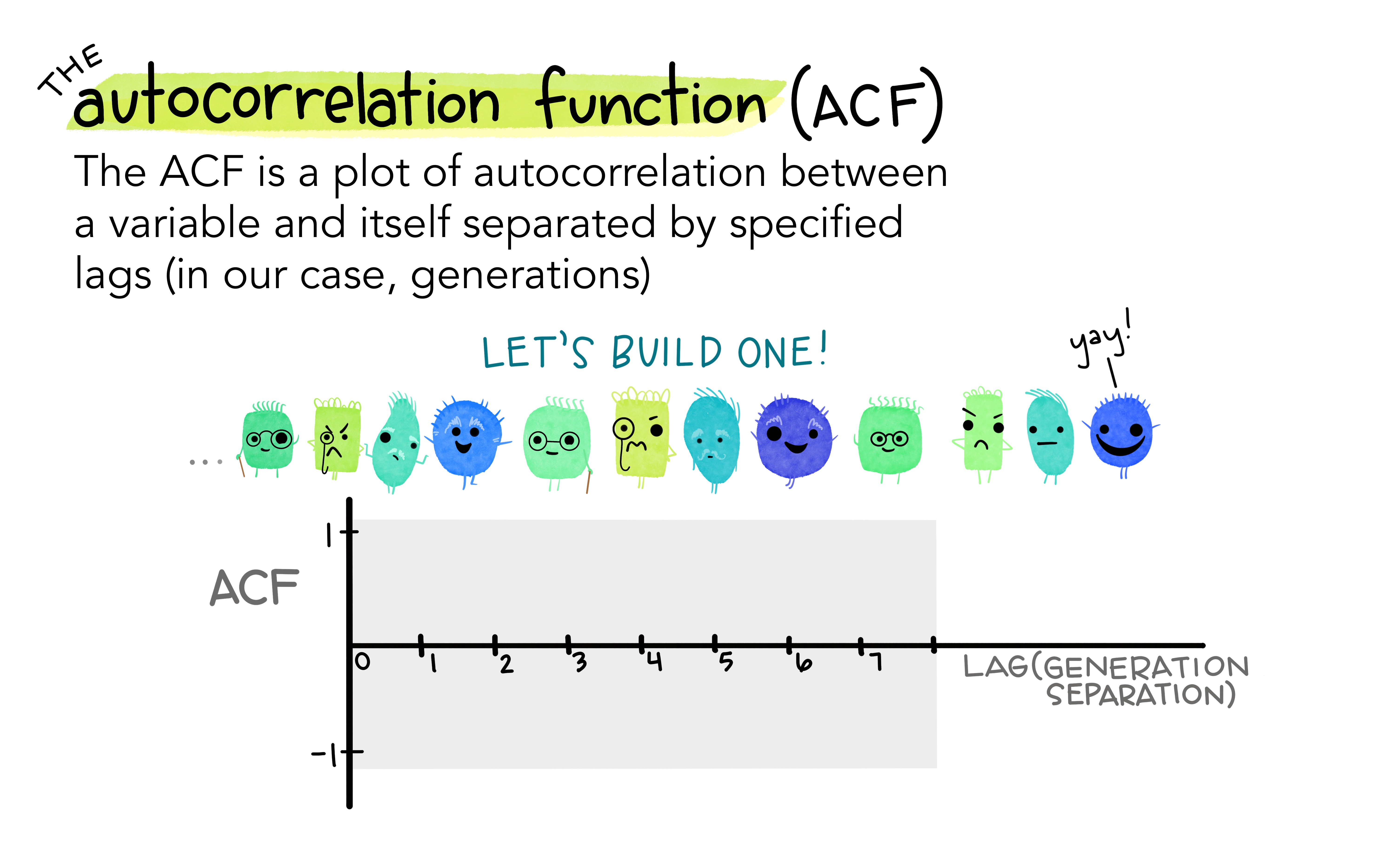
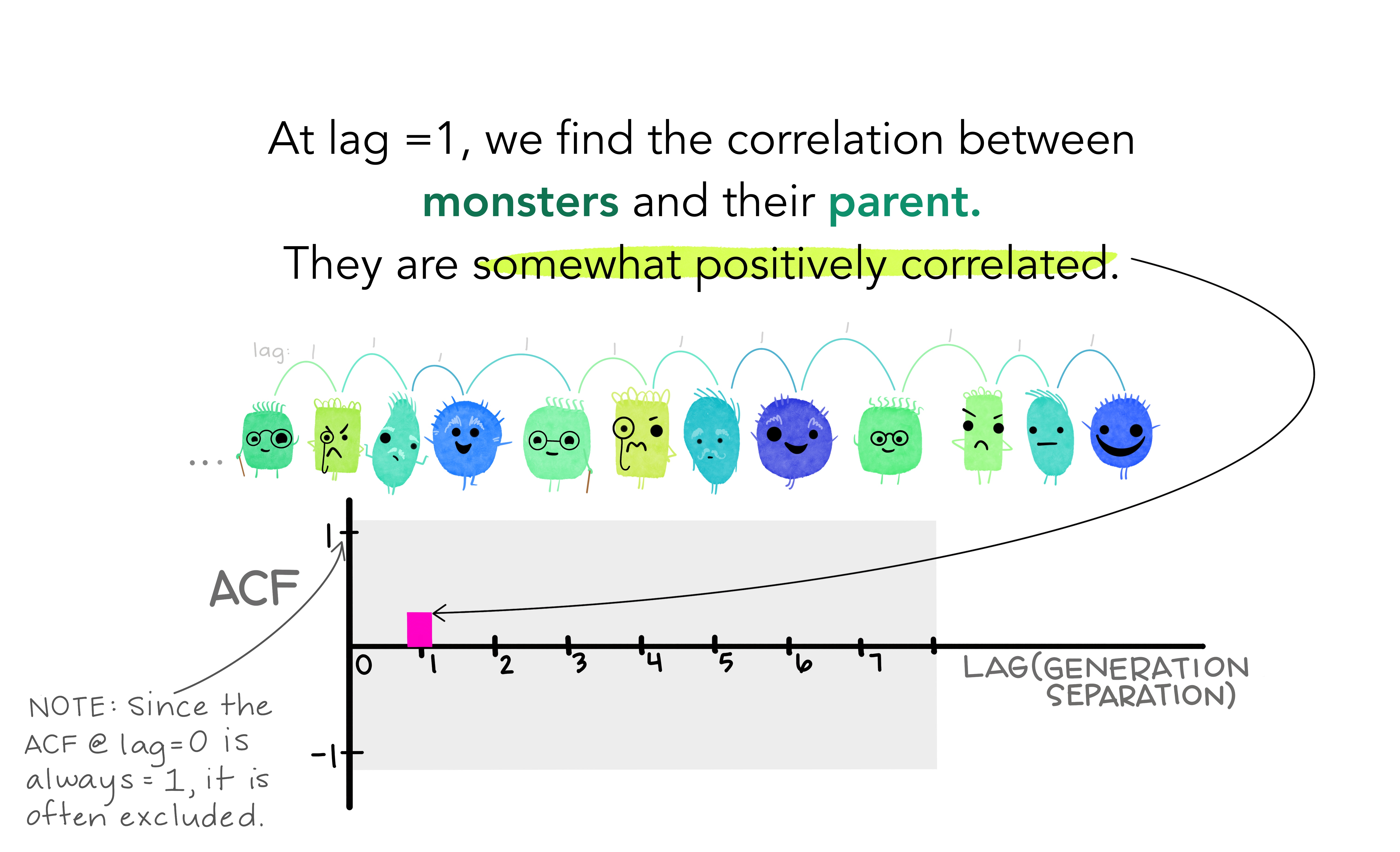
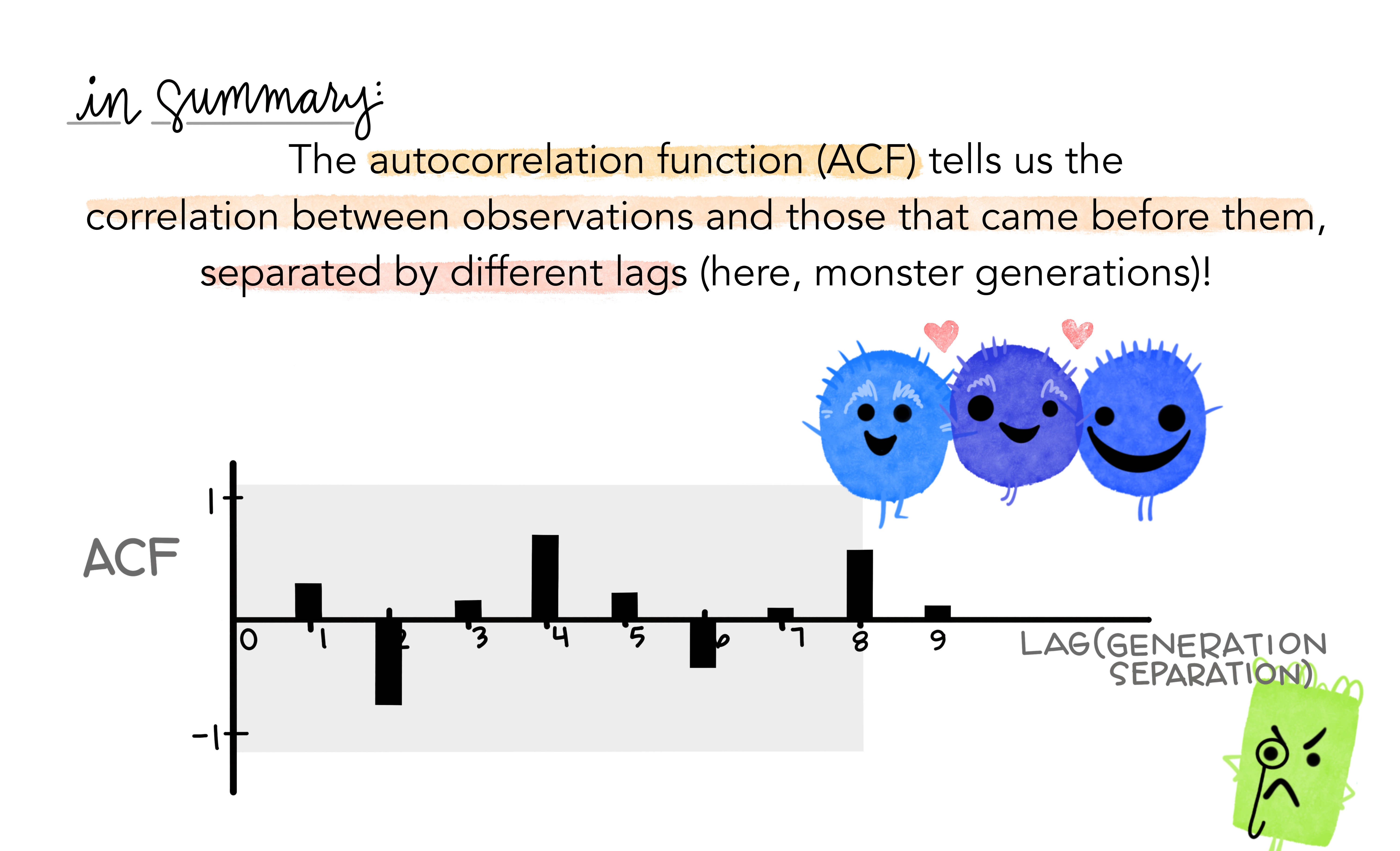
20.12 Autocorrelation
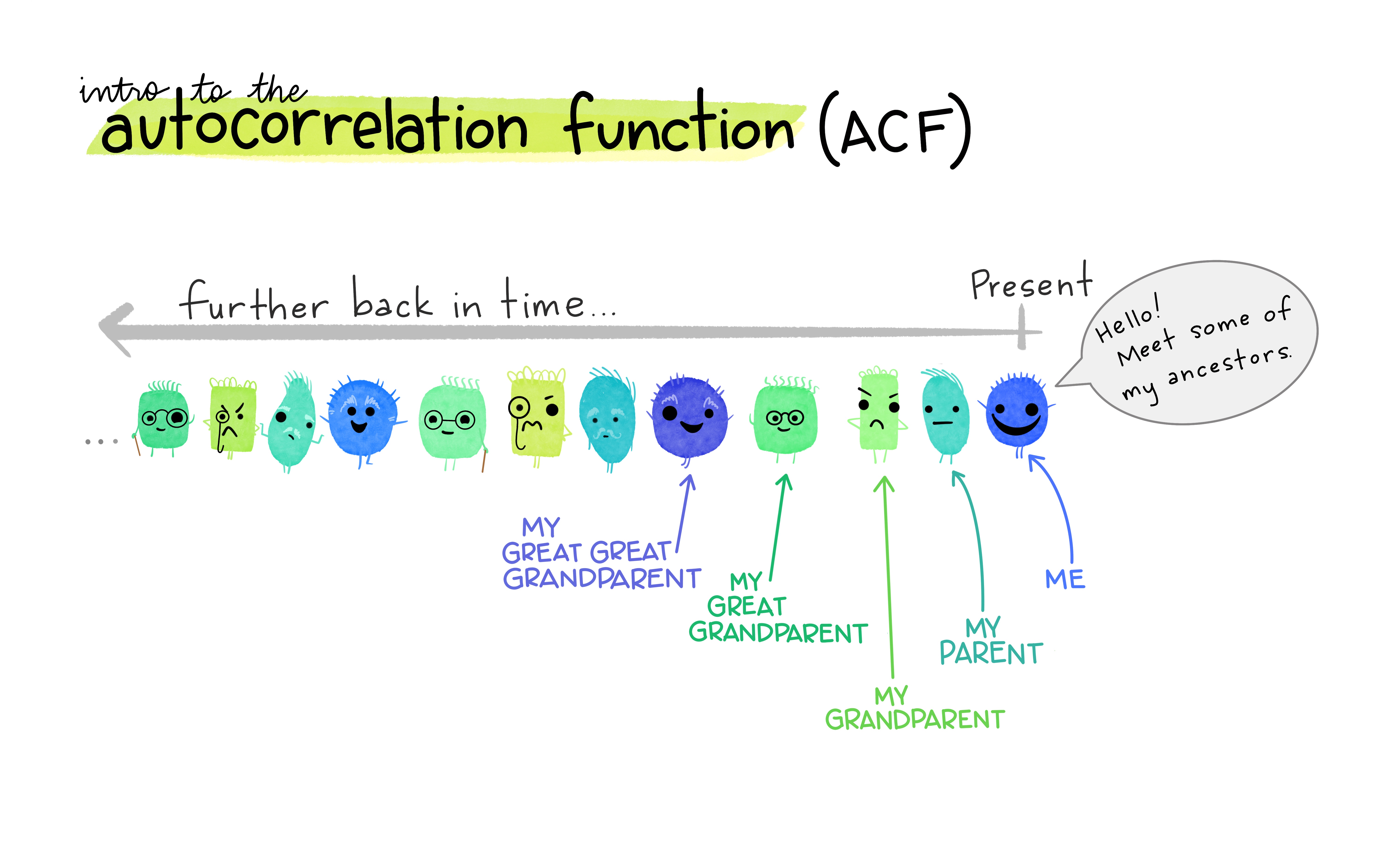
Covariance and correlation: measure extent of linear relationship between two variables (\(y\) and \(X\)).
Autocovariance and autocorrelation: measure linear relationship between lagged values of a time series \(y\).
We measure the relationship between:
- \(y_{t}\) and \(y_{t-1}\)
- \(y_{t}\) and \(y_{t-2}\)
- \(y_{t}\) and \(y_{t-3}\)
- etc.
We denote the sample autocovariance at lag \(k\) by \(c_k\) and the sample autocorrelation at lag \(k\) by \(r_k\). Then define
- \(r_1\) indicates how successive values of \(y\) relate to each other
- \(r_2\) indicates how \(y\) values two periods apart relate to each other
- \(r_k\) is the same as the sample correlation between \(y_t\) and \(y_{t-k}\).
Results for first 9 lags for beer data:
| \(r_1\) | \(r_2\) | \(r_3\) | \(r_4\) | \(r_5\) | \(r_6\) | \(r_7\) | \(r_8\) | \(r_9\) |
|---|---|---|---|---|---|---|---|---|
| -0.097 | -0.651 | -0.072 | 0.872 | -0.074 | -0.628 | -0.083 | 0.825 | -0.088 |
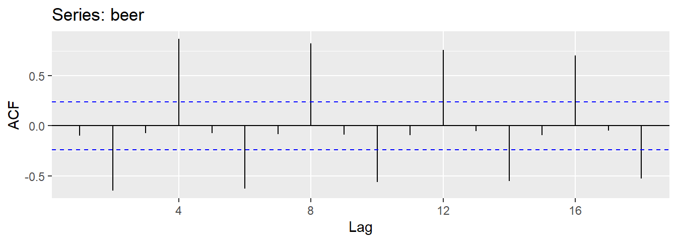
- \(r_{4}\) higher than for the other lags. This is due to the seasonal pattern in the data: the peaks tend to be 4 quarters apart and the troughs tend to be 2 quarters apart.
- \(r_2\) is more negative than for the other lags because troughs tend to be 2 quarters behind peaks.
- Together, the autocorrelations at lags 1, 2, , make up the or ACF.
- The plot is known as a correlogram
REMARK An occasional autocorrelation will be statistically significant by chance alone. You can ignore a statistically significant autocorrelation if it is isolated, preferably at a high lag, and if it does not occur at a seasonal lag.
ggAcf(beer)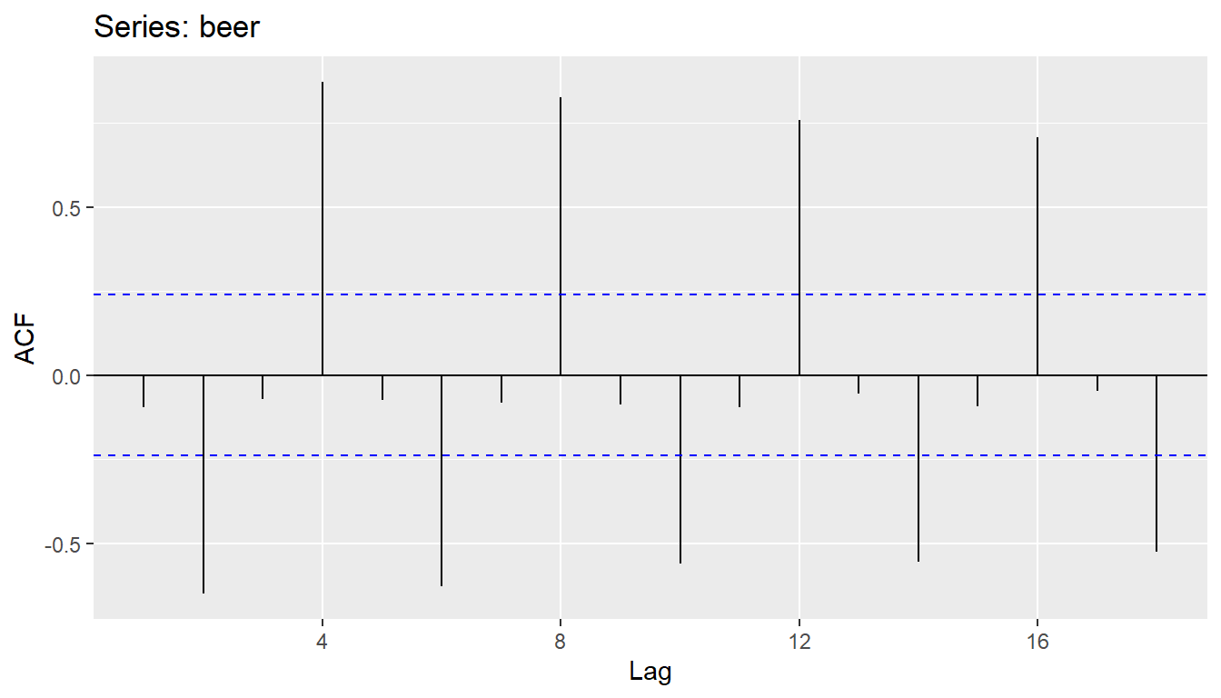
20.12.1 Trend and seasonality in ACF plots
- When data have a trend, the autocorrelations for small lags tend to be large and positive.
- When data are seasonal, the autocorrelations will be larger at the seasonal lags (i.e., at multiples of the seasonal frequency)
- When data are trended and seasonal, you see a combination of these effects.
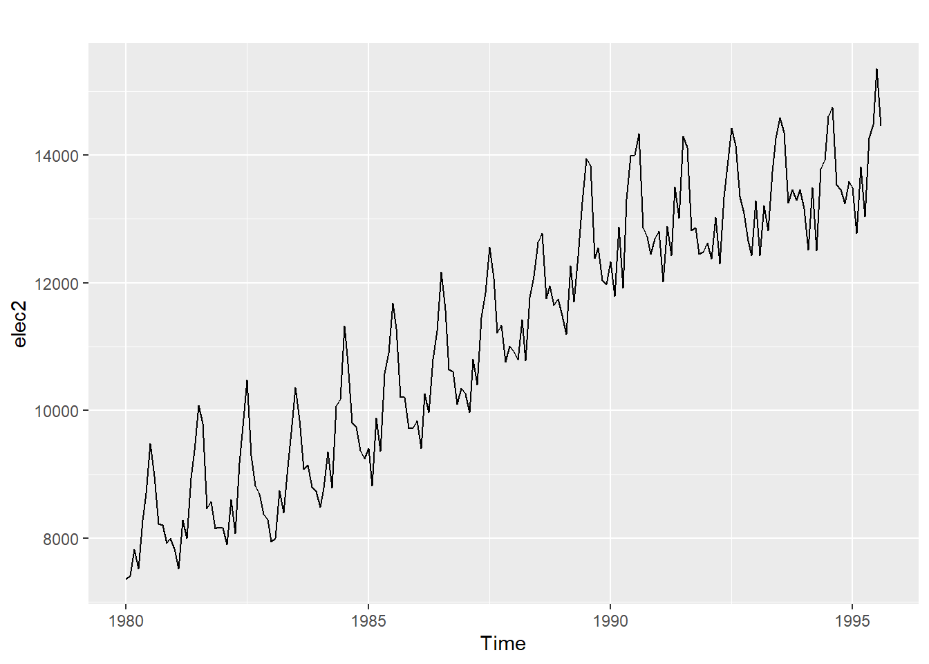
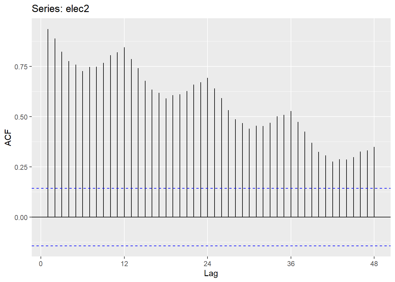
20.12.4 Monthly electricity production
Time plot shows clear trend and seasonality.
The same features are reflected in the ACF.
- The slowly decaying ACF indicates trend.
- The ACF peaks at lags 12, 24, 36, , indicate seasonality of length 12.
20.12.5 White noise
Time series that show no autocorrelation are called white noise.
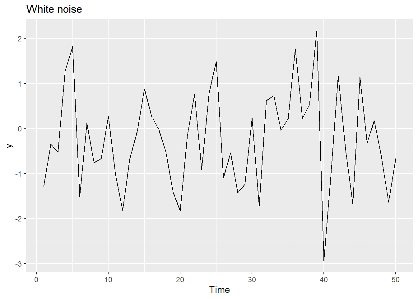
Sample autocorrelations for white noise series:
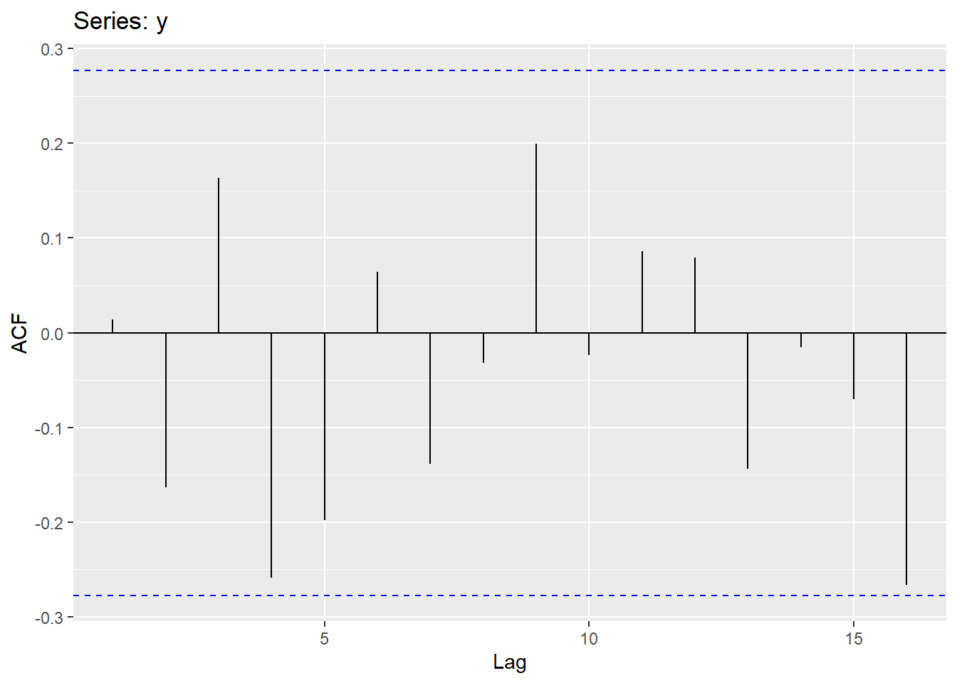
We expect each autocorrelation to be close to zero.
All autocorrelation coefficients lie within these limits, confirming that the data are white noise. More precisely, the data cannot be distinguished from white noise.
If one or more large spikes are outside these bounds, or if substantially more than 5% of spikes are outside these bounds, then the series is probably not white noise.
20.13 Partial autocorrelation
The partial autocorrelation function PACF is another tool for revealing the interrelationships in a time series. Basically instead of finding correlations of present with lags like ACF, it finds correlation of the residuals (which remains after removing the effects which are already explained by the earlier lag(s)) with the next lag value hence partial and not complete as we remove already found variations before we find the next correlation. So if there is any hidden information in the residual which can be modeled by the next lag, we might get a good correlation and we will keep that next lag as a feature while modeling (next week).
Lag values whose lines cross above the dotted line are statistically significant.
It’s easy to compute the PACF for a variable in R using the pacf() function, which will automatically plot a correlogram when called by itself.
Let’s look at the PACF for the CO2 data (atmospheric concentrations of CO2 are expressed in parts per million (ppm) and reported in the preliminary manometric mole fraction scale):
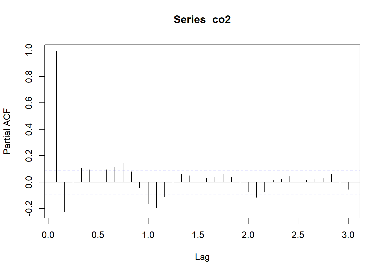
Notice, that the partial autocorrelation at lag-1 is very high (it equals the ACF at lag-1), but the other values at lags > 1 are relatively small.
Notice also that the PACF plot again has real-valued indices for the time lag, but it does not include any value for lag-0 because it is impossible to remove any intermediate autocorrelation between t and t−k when k=0, and therefore the PACF does not exist at lag-0.
20.14 Stationarity
A stationary time series is one whose statistical properties do not depend on the time at which the series is observed. Thus, time series with trends, or with seasonality, are not stationary - the trend and seasonality will affect the value of the time series at different times. On the other hand, a white noise series is stationary - it does not matter when you observe it, it should look much the same at any point in time.
A stationary series is:
- roughly horizontal
- constant variance
- no patterns predictable in the long-term
Identifying non-stationary series:
- The ACF of stationary data drops to zero relatively quickly
- The ACF of non-stationary data decreases slowly.
- For non-stationary data, the value of \(r_1\) is often large and positive.
When investigating a time series, one of the first things to check before building a time series model is to check that the series is stationary.
Here, we will look at a couple methods for checking stationarity.
If the time series is provided with seasonality, a trend, or a change point in the mean or variance, then the influences need to be removed or accounted for.
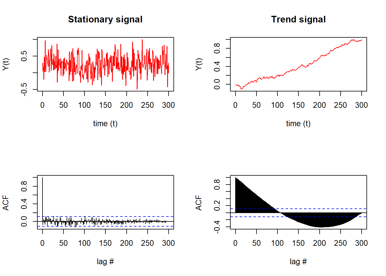
Notably, the stationary signal (top left) results in few significant lags that exceed the confidence interval of the ACF (blue dashed line, bottom left).
In comparison, the time series with a trend (top right) results in almost all lags exceeding the confidence interval of the ACF (bottom right).
Qualitatively, we can see and conclude from the ACFs that the signal on the left is stationary (due to the lags that die out) while the signal on the right is not stationary (since later lags exceed the confidence interval).
20.15 Transformations
Transformations help to stabilize the variance.
Adjusting the historical data can often lead to a simpler modeling task.
Here, we deal with four kinds of adjustments: calendar adjustments, population adjustments, inflation adjustments and mathematical transformations. The purpose of these adjustments and transformations is to simplify the patterns in the historical data by removing known sources of variation or by making the pattern more consistent across the whole data set.
20.15.1 Calendar adjustments
Some of the variation seen in seasonal data may be due to simple calendar effects. In such cases, it is usually much easier to remove the variation before fitting a forecasting model. The monthdays() function will compute the number of days in each month or quarter.
dframe <- cbind(Monthly = milk,
                DailyAverage = milk/monthdays(milk))
  autoplot(dframe, facet=TRUE) +
    xlab("Years") + ylab("Pounds") +
    ggtitle("Milk production")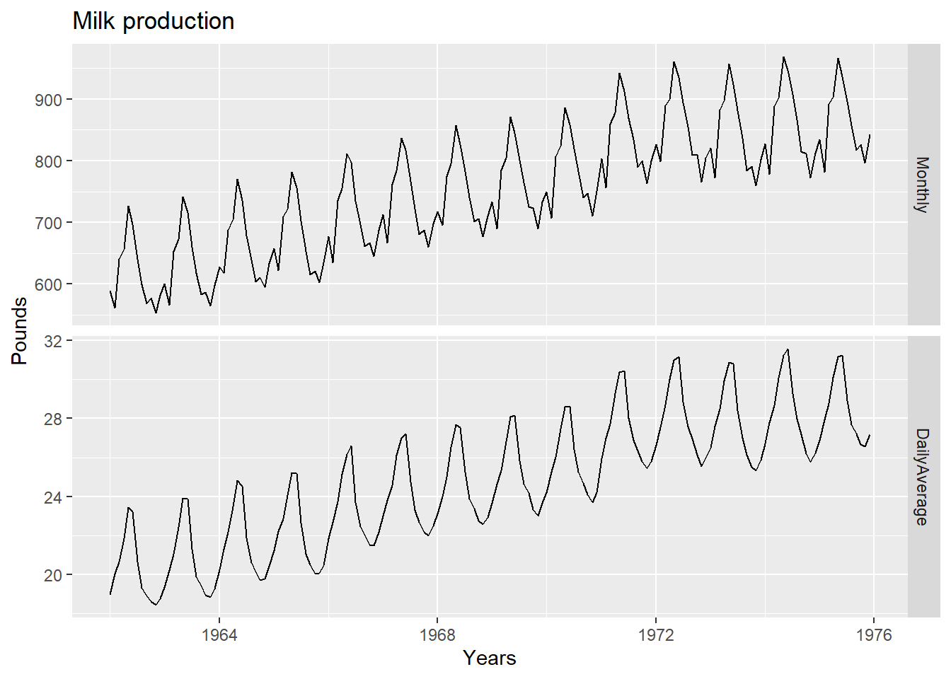
Notice how much simpler the seasonal pattern is in the average daily production plot compared to the total monthly production plot. By looking at the average daily production instead of the total monthly production, we effectively remove the variation due to the different month lengths.
20.15.2 Population adjustments
Any data that are affected by population changes can be adjusted to give per-capita data. That is, consider the data per person (or per thousand people, or per million people) rather than the total.
For most data that are affected by population changes, it is best to use per-capita data rather than the totals.
20.15.3 Inflation adjustments
Data which are affected by the value of money are best adjusted before modelling. For example, the average cost of a new house will have increased over the last few decades due to inflation. A $200,000 house this year is not the same as a $200,000 house twenty years ago.
For this reason, financial time series are usually adjusted so that all values are stated in dollar values from a particular year. For example, the house price data may be stated in year 2000 dollars.
20.15.4 Mathematical transformations
If the data show variation that increases or decreases with the level of the series, then a transformation can be useful. For example, a logarithmic transformation is often useful.
Logarithms are useful because they are interpretable: changes in a log value are relative (or percentage) changes on the original scale. So if log base 10 is used, then an increase of 1 on the log scale corresponds to a multiplication of 10 on the original scale. Another useful feature of log transformations is that they constrain the forecasts to stay positive on the original scale.
Sometimes other transformations are also used (although they are not so interpretable). For example, square roots and cube roots can be used.
A useful family of transformations, that includes both logarithms and power transformations, is the family of Box-Cox transformations (Box & Cox, 1964), which depend on the parameter λ (lambda).
For the observed time series xt and a transformation parameter λ, that can be estimated, the transformed series is given by:
\[\begin{align*} &y_{t} &= \left\{\begin{matrix} \log(x_{t}) &{\lambda} = 0 \\ (x_{t}^{\lambda}-1) &{\lambda} \neq 0 \end{matrix}\right. \end{align*}\]
A good value of λ is one which makes the size of the seasonal variation about the same across the whole series, as that makes the forecasting model simpler.
The BoxCox.lambda() function will choose a value of lambda for you.
(lambda <- BoxCox.lambda(elec))[1] 0.2654076#0.2654
autoplot(BoxCox(elec,lambda))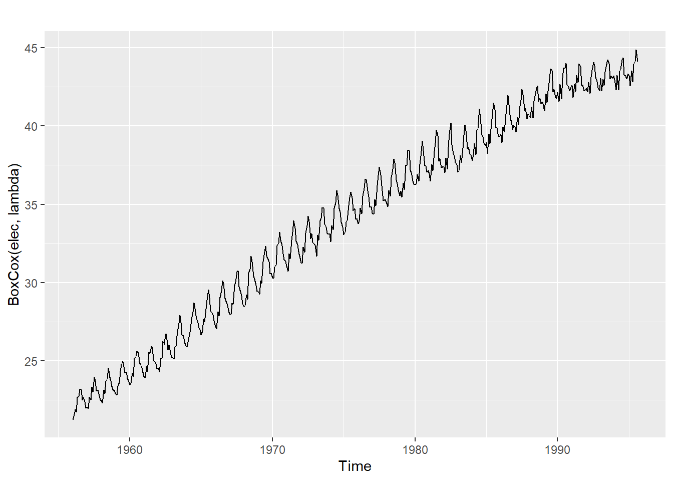
20.16 Differencing
- Differencing helps to stabilize the mean.
- The differenced series is the change between each observation in the original series: \({y'_t = y_t - y_{t-1}}\).
- The differenced series will have only \(T-1\) values since it is not possible to calculate a difference \(y_1'\) for the first observation.
20.16.1 Second-order differencing
Occasionally the differenced data will not appear stationary and it may be necessary to difference the data a second time.
- \(y_t''\) will have \(T-2\) values.
- In practice, it is almost never necessary to go beyond second-order differences.
20.16.2 Seasonal differencing
A seasonal difference is the difference between an observation and the corresponding observation from the previous year.\[{y'_t = y_t - y_{t-m}}\] where \(m=\) number of seasons.
- For monthly data \(m=12\).
- For quarterly data \(m=4\).
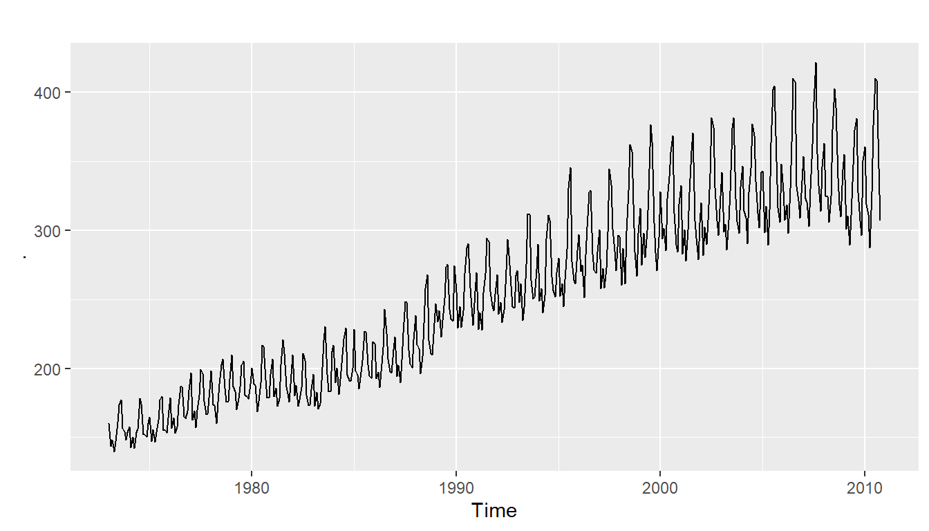
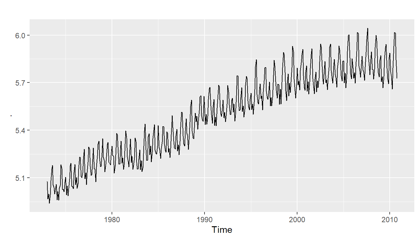
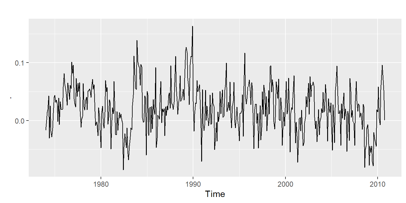
20.16.7 Electricity production
- Seasonally differenced series is closer to being stationary.
- Remaining non-stationarity can be removed with further first difference.
20.16.8 Seasonal differencing
When both seasonal and first differences are applied
- it makes no difference which is done first—the result will be the same.
- If seasonality is strong, we recommend that seasonal differencing be done first because sometimes the resulting series will be stationary and there will be no need for further first difference.
It is important that if differencing is used, the differences are interpretable.
20.17 Unit root tests
One way to determine more objectively whether differencing is required is to use a unit root test.
A unit root (also called a unit root process or a difference stationary process) is a stochastic trend in a time series, sometimes called a “random walk with drift”. If a time series has a unit root, it shows a systematic pattern that is unpredictable.
The reason why it’s called a unit root is because of the mathematics behind the process. At a basic level, a process can be written as a series of monomials (expressions with a single term). Each monomial corresponds to a root. If one of these roots is equal to 1, then that’s a unit root.
The math behind unit roots is beyond the scope of this course. All you really need to know if you’re analyzing time series is that the existence of unit roots can cause your analysis to have serious issues like:
- Spurious regressions: you could get high r-squared values even if the data is uncorrelated.
- Errant behavior due to assumptions for analysis not being valid.
- A time series has stationarity if a shift in time doesn’t cause a change in the shape of the distribution; unit roots are one cause for non-stationarity.
These are statistical hypothesis tests of stationarity that are designed for determining whether differencing is required.
In this tests, the null hypothesis is that the data are stationary, and we look for evidence that the null hypothesis is false. Consequently, small p-values (e.g., less than 0.05) suggest that differencing is required.
- Augmented Dickey Fuller test: null hypothesis is that the data are non-stationary and non-seasonal.
- Kwiatkowski-Phillips-Schmidt-Shin (KPSS) test: null hypothesis is that the data are stationary and non-seasonal.
- Other tests available for seasonal data.
20.17.1 KPSS test
library(urca)
summary(ur.kpss(goog))
#######################
# KPSS Unit Root Test #
#######################

Test is of type: mu with 7 lags.

Value of test-statistic is: 10.7223

Critical value for a significance level of:
                10pct  5pct 2.5pct  1pct
critical values 0.347 0.463  0.574 0.739
# p-value < 0.05 indicates the TS is stationaryThe test statistic is much bigger than the 1% critical value, indicating that the null hypothesis is rejected. That is, the data are not stationary.
We can difference the data, and apply the test again.
goog %>% diff() %>% ur.kpss() %>% summary()
#######################
# KPSS Unit Root Test #
#######################

Test is of type: mu with 7 lags.

Value of test-statistic is: 0.0324

Critical value for a significance level of:
                10pct  5pct 2.5pct  1pct
critical values 0.347 0.463  0.574 0.739
This time, the test statistic is tiny, and well within the range we would expect for stationary data.
So we can conclude that the differenced data are stationary.
This process of using a sequence of KPSS tests to determine the appropriate number of first differences is carried out by the function ndiffs():
ndiffs(goog)[1] 1As we saw from the KPSS tests above, one difference is required to make the goog data stationary.
We can also use an Augmented Dickey-Fuller Test (adf test). A p-Value of less than 0.05 in adf.test() indicates that it is stationary.
adf.test(goog) # p-value < 0.05 indicates the TS is stationary
    Augmented Dickey-Fuller Test

data:  goog
Dickey-Fuller = -2.5417, Lag order = 9,
p-value = 0.349
alternative hypothesis: stationary
20.17.2 Automatically selecting differences
A similar function for determining whether seasonal differencing is required is nsdiffs(), which uses the measure of seasonal strength to determine the appropriate number of seasonal differences required.
No seasonal differences are suggested if FS<0.64, otherwise one seasonal difference is suggested.
STL decomposition: \(y_t = T_t+S_t+R_t\)
Seasonal strength \(F_s = \max\big(0, 1-\frac{\text{Var}(R_t)}{\text{Var}(S_t+R_t)}\big)\)
If \(F_s > 0.64\), do one seasonal difference.
\*{1cm}
usmelec %>% log() %>% nsdiffs()[1] 1usmelec %>% log() %>% diff(lag=12) %>% ndiffs()[1] 1Because nsdiffs() returns 1 (indicating one seasonal difference is required), we apply the ndiffs() function to the seasonally differenced data.
These functions suggest we should do both a seasonal difference and a first difference.
20.18 Missing values in TSA
20.18.1 Introduction
In time series data, if there are missing values, there are two ways to deal with the incomplete data:
- omit the entire record that contains information.
- Impute the missing information.
Since the time series data has temporal property, only some of the statistical methodologies are appropriate for time series data.
20.18.2 Types of time series data
Before talking about the imputation methods, let us classify the time series data according to the composition.
If we decompose the time series data with linear regression model, it is:
\(Y_t = m_t+s_t+\epsilon_t\)
where \(m_t\) stands for trend, \(s_t\) stands for seasonality, and \(\epsilon_t\) stands for random variables
Based on the equation above, there can be four types of time series data:
- no trend or seasonality (fig1)
- has trend, but no seasonality (fig2)
- has seasonality, but no trend (fig3)
- has both trend and seasonality (fig4)
20.18.3 Time series imputation
20.18.3.1 Non-time-series specific method
- mean imputation
- median imputation
- mode imputation
calculate the appropriate measure and replace NAs with the values.
20.18.3.2 Stationary time series
*Appropriate for stationary time series, for example, white noise data
- Random sample imputation
replace missing values with observations randomly selected from the remaining (either of it or just some section of it)
It is not likely to work well unless the random select is carefully chosen
# This is the AirPassenger data with some observations removed
plot(tsAirgap, main="AirPassenger data with missing values")
statsNA(tsAirgap)[1] "Length of time series:"
[1] 144
[1] "-------------------------"
[1] "Number of Missing Values:"
[1] 13
[1] "-------------------------"
[1] "Percentage of Missing Values:"
[1] "9.03%"
[1] "-------------------------"
[1] "Number of Gaps:"
[1] 11
[1] "-------------------------"
[1] "Average Gap Size:"
[1] 1.181818
[1] "-------------------------"
[1] "Stats for Bins"
[1] " Bin 1 (36 values from 1 to 36) : 4 NAs (11.1%)"
[1] " Bin 2 (36 values from 37 to 72) : 1 NAs (2.78%)"
[1] " Bin 3 (36 values from 73 to 108) : 5 NAs (13.9%)"
[1] " Bin 4 (36 values from 109 to 144) : 3 NAs (8.33%)"
[1] "-------------------------"
[1] "Longest NA gap (series of consecutive NAs)"
[1] "3 in a row"
[1] "-------------------------"
[1] "Most frequent gap size (series of consecutive NA series)"
[1] "1 NA in a row (occurring 10 times)"
[1] "-------------------------"
[1] "Gap size accounting for most NAs"
[1] "1 NA in a row (occurring 10 times, making up for overall 10 NAs)"
[1] "-------------------------"
[1] "Overview NA series"
[1] " 1 NA in a row: 10 times"
[1] " 3 NA in a row: 1 times"par(mfrow=c(2,2))
# Mean Imputation
plot(na.mean(tsAirgap, option = "mean") - AirPassengers, ylim = c(-mean(AirPassengers), mean(AirPassengers)), ylab = "Difference", main = "Mean")
mean((na.mean(tsAirgap, option = "mean") - AirPassengers)^2)[1] 1198.903# Median Imputation
plot(na.mean(tsAirgap, option = "median") - AirPassengers, ylim = c(-mean(AirPassengers), mean(AirPassengers)), ylab = "Difference", main = "Median")
mean((na.mean(tsAirgap, option = "median") - AirPassengers)^2)[1] 1258.083# Mode Imputation
plot(na.mean(tsAirgap, option = "mode") - AirPassengers, ylim = c(-mean(AirPassengers), mean(AirPassengers)), ylab = "Difference", main = "Mode")
mean((na.mean(tsAirgap, option = "mode") - AirPassengers)^2) [1] 1481# Random Imputation
plot(na.random(tsAirgap) - AirPassengers, ylim = c(-mean(AirPassengers), mean(AirPassengers)), ylab = "Difference", main = "Random")
mean((na.random(tsAirgap) - AirPassengers)^2)[1] 3364.73220.18.4 Time-Series specific method
- Last observation carried forward (LOCF)
- Next observation carried backward (NOCB)
- Linear interpolation
- Spline interpolation
These methods rely on the assumption that adjacent observations are similar to one another. These methods do not work well when this assumption is not valid, especially when the presence of strong seasonality.
par(mfrow=c(2,2))
# Last Observartion Carried Forward
plot(na.locf(tsAirgap, option = "locf") - AirPassengers, ylim = c(-mean(AirPassengers), mean(AirPassengers)), ylab = "Difference", main = "LOCF")
m1 <- mean((na.locf(tsAirgap, option = "locf") - AirPassengers)^2)

# Next Observartion Carried Backward
plot(na.locf(tsAirgap, option = "nocb") - AirPassengers, ylim = c(-mean(AirPassengers), mean(AirPassengers)), ylab = "Difference", main = "NOCB")
m2 <- mean((na.locf(tsAirgap, option = "nocb") - AirPassengers)^2)

# Linear Interpolation
plot(na.interpolation(tsAirgap, option = "linear") - AirPassengers, ylim = c(-mean(AirPassengers), mean(AirPassengers)), ylab = "Difference", main = "Linear")
m3 <- mean((na.interpolation(tsAirgap, option = "linear") - AirPassengers)^2)

# Spline Interpolation
plot(na.interpolation(tsAirgap, option = "spline") - AirPassengers, ylim = c(-mean(AirPassengers), mean(AirPassengers)), ylab = "Difference", main = "Spline")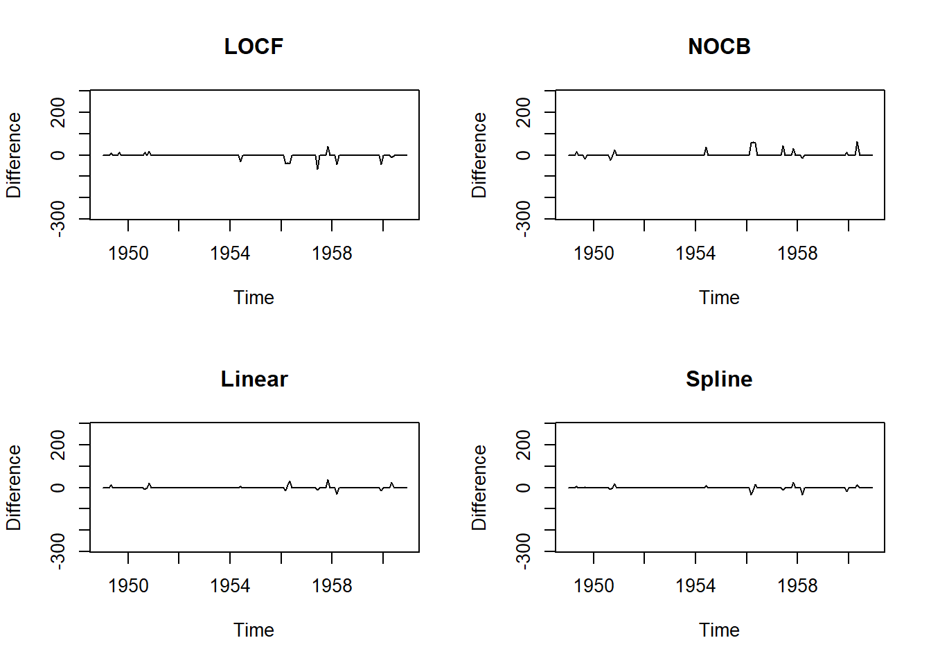
m4 <- mean((na.interpolation(tsAirgap, option = "spline") - AirPassengers)^2)

data.frame(methods=c('LOCF', 'NACB', 'Linear', 'Spline'), MSE=c(m1, m2, m3, m4))
methods MSE
1 LOCF 113.53472
2 NACB 142.04861
3 Linear 37.06684
4 Spline 30.2940520.18.5 The Combination of Seasonal Adjustment and other methods
This approach is very effective when seasonality is present.
We de-seasonalize the data first, and then do interpolation on the data.
Once the mising values are inputed, we need to re-seasonalize the data.
par(mfrow=c(2,2))
# Seasonal Adjustment then Random
plot(na.seadec(tsAirgap, algorithm = "random") - AirPassengers, ylim = c(-mean(AirPassengers), mean(AirPassengers)), ylab = "Difference", main = "Seas-Adj -> Random")
ma1 <- mean((na.seadec(tsAirgap, algorithm = "random") - AirPassengers)^2)

# Seasonal Adjustment then Mean
plot(na.seadec(tsAirgap, algorithm = "mean") - AirPassengers, ylim = c(-mean(AirPassengers), mean(AirPassengers)), ylab = "Difference", main = "Seas-Adj -> Mean")
ma2 <- mean((na.seadec(tsAirgap, algorithm = "mean") - AirPassengers)^2)

# Seasonal Adjustment then LOCF
plot(na.seadec(tsAirgap, algorithm = "locf") - AirPassengers, ylim = c(-mean(AirPassengers), mean(AirPassengers)), ylab = "Difference", main = "Seas-Adj -> LOCF")
ma3 <- mean((na.seadec(tsAirgap, algorithm = "locf") - AirPassengers)^2)

# Seasonal Adjustment then Linear Interpolation
plot(na.seadec(tsAirgap, algorithm = "interpolation") - AirPassengers, ylim = c(-mean(AirPassengers), mean(AirPassengers)), ylab = "Difference", main = "Seas-Adj -> Linear")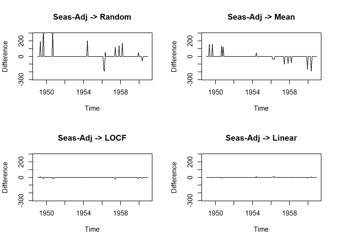
ma4 <- mean((na.seadec(tsAirgap, algorithm = "interpolation") - AirPassengers)^2)

data.frame(methods=c("Seas-Adj+Random", "Seas-Adj+Mean", "Seas-Adj+LOCF","Seas-Adj+Linear"),
           MSE=c(ma1, ma2, ma3, ma4))
methods MSE
1 Seas-Adj+Random 3301.990618
2 Seas-Adj+Mean 1209.074979
3 Seas-Adj+LOCF 10.878180
4 Seas-Adj+Linear 3.70154120.18.7 Cheat-sheet
Very useful might be also the following cheat-sheet.
20.19 Identifying outliers
Outliers are observations that are very different from the majority of the observations in the time series. They may be errors, or they may simply be unusual.
Simply replacing outliers without thinking about why they have occurred is a dangerous practice. They may provide useful information about the process that produced the data, and which should be taken into account when forecasting.
The tsoutliers() function is designed to identify outliers, and to suggest potential replacement values.
tsoutliers(gold)$index
[1] 770
$replacements
[1] 494.9Another useful function is tsclean() which identifies and replaces outliers, and also replaces missing values.
Obviously this should be used with some caution, but it does allow us to use various models that are sensitive to outliers, i.e. ARIMA or ETS.
gold %>%
  tsclean() %>%
  ets() %>%
  forecast(h=50) %>%
  autoplot()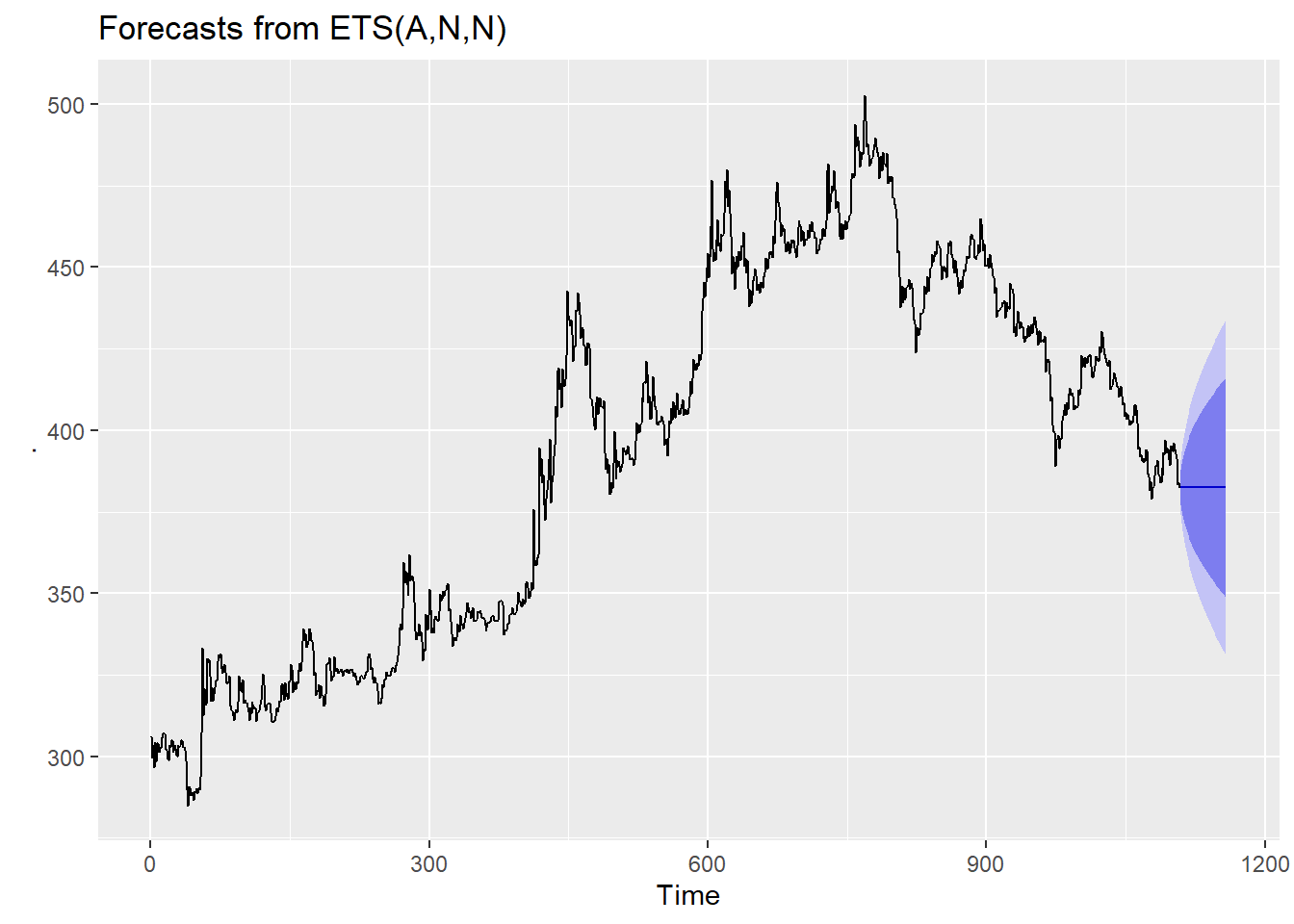
20.19.1 Anomalies detection
Anomalies are essentially the outliers in our data. If something happens regularly, it is not an anomaly but a trend. Things which happen once or twice and are deviant from the usual behavior, whether continuously or with lags are all anomalies. So it all boils down to the definition of outliers for our data.
R provides a lot of packages with different approaches to anomaly detection. We will use the anomalize package in R to understand the concept of anomalies using one such method.
The anomalize package is a feature rich package for performing anomaly detection. It is geared towards time series analysis, which is one of the biggest needs for understanding when anomalies occur.
We are going to use the tidyverse_cran_downloads data set that comes with anomalize. It is a tibbletime object (class tbl_time), which is the object structure that anomalize works.
tidyverse_cran_downloads# A time tibble: 6,375 × 3
# Index: date
# Groups: package [15]
date count package
<date> <dbl> <chr>
1 2017-01-01 873 tidyr
2 2017-01-02 1840 tidyr
3 2017-01-03 2495 tidyr
4 2017-01-04 2906 tidyr
5 2017-01-05 2847 tidyr
6 2017-01-06 2756 tidyr
7 2017-01-07 1439 tidyr
8 2017-01-08 1556 tidyr
9 2017-01-09 3678 tidyr
10 2017-01-10 7086 tidyr
# … with 6,365 more rowsWe can use the general workflow for anomaly detection, which involves three main functions:
- time_decompose(): Separates the time series into seasonal, trend, and remainder components
- anomalize(): Applies anomaly detection methods to the remainder component.
- time_recompose(): Calculates limits that separate the normal data from the anomalies!
tidyverse_cran_downloads_anomalized <- tidyverse_cran_downloads %>%
    time_decompose(count, merge = TRUE) %>%
    anomalize(remainder) %>%
    time_recompose()

tidyverse_cran_downloads_anomalized %>% glimpse()
Rows: 6,375
Columns: 12
Groups: package [15]
$ package <chr> "broom", "broom", "broom",…
$ date <date> 2017-01-01, 2017-01-02, 2…
$ count <dbl> 1053, 1481, 1851, 1947, 19…
$ observed <dbl> 1.053000e+03, 1.481000e+03…
$ season <dbl> -1006.9759, 339.6028, 562.…
$ trend <dbl> 1708.465, 1730.742, 1753.0…
$ remainder <dbl> 351.510801, -589.344328, -…
$ remainder_l1 <dbl> -1724.778, -1724.778, -172…
$ remainder_l2 <dbl> 1704.371, 1704.371, 1704.3…
$ anomaly <chr> "No", "No", "No", "No", "N…
$ recomposed_l1 <dbl> -1023.2887, 345.5664, 590.…
$ recomposed_l2 <dbl> 2405.860, 3774.715, 4019.9…The functions presented above performed a time series decomposition on the count column using seasonal decomposition.
It created four columns:
observed: The observed values (actuals)
season: The seasonal or cyclic trend. The default for daily data is a weekly seasonality.
trend: This is the long term trend. The default is a Loess smoother using spans of 3-months for daily data.
remainder: This is what we want to analyze for outliers. It is simply the observed minus both the season and trend. Setting merge = TRUE keeps the original data with the newly created columns.
anomalize (remainder): This performs anomaly detection on the remainder column. It creates three new columns:
remainder_l1: The lower limit of the remainder
remainder_l2: The upper limit of the remainder
anomaly: Yes/No telling us whether or not the observation is an anomaly
time_recompose(): This recomposes the season, trend and remainder_l1 and remainder_l2 columns into new limits that bound the observed values. The two new columns created are:
recomposed_l1: The lower bound of outliers around the observed value
recomposed_l2: The upper bound of outliers around the observed value
We can then visualize the anomalies using the plot_anomalies() function. It is not maybe very clear, because we can see all of variables (packages downloaded from CRAN) and their anomalies detected:
tidyverse_cran_downloads_anomalized %>%
    plot_anomalies(ncol = 3, alpha_dots = 0.25)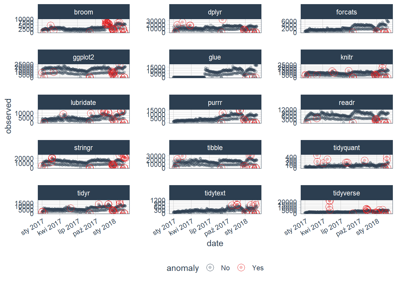
If you want to visualize what is happening, now is a good point to try out another plotting function, plot_anomaly_decomposition(). It only works on a single time series so we will need to select just one to review. The season is removing the weekly cyclic seasonality. The trend is smooth, which is desirable to remove the central tendency without overfitting. Finally, the remainder is analyzed for anomalies detecting the most significant outliers.
tidyverse_cran_downloads %>%

    # Select a single time series
    filter(package == "lubridate") %>%
    ungroup() %>%

    # Anomalize
    time_decompose(count, method = "stl", frequency = "auto", trend = "auto") %>%
    anomalize(remainder, method = "iqr", alpha = 0.05, max_anoms = 0.2) %>%

    # Plot Anomaly Decomposition
    plot_anomaly_decomposition() +
    ggtitle("Lubridate Downloads: Anomaly Decomposition")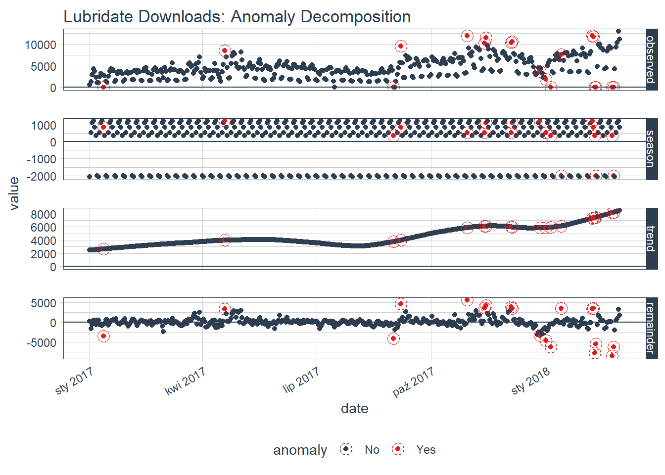
You can also adjust the parameter settings. The first settings you may wish to explore are related to time series decomposition: trend and seasonality. The second are related to anomaly detection: alpha and max anoms. Read more about adjustments here.
To be honest, there is also a very convenient package available on GitHub (so you will need to install that one directly from github) - it is called AnomalyDetection. Read more about that one here. The tutorial for that library is available on DataCamp & youtube: